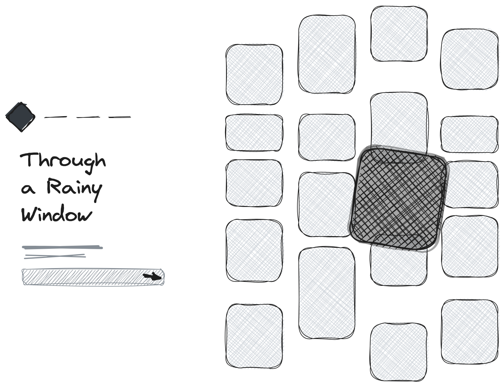
Interactive Masonry Image Gallery with Smooth Animations
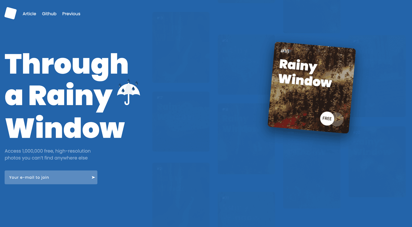
Are you looking to add an eye-catching and interactive image gallery to your website? Look no further! In this blog post, we'll walk you through the process of creating an impressive masonry image gallery with smooth animations using some powerful web development tools and libraries.
The interactive masonry image gallery we'll create combines the dynamic grid layout provided by the Masonry library with smooth animations powered by GSAP (GreenSock Animation Platform) and interactive scrolling effects using ScrollMagic. This combination allows us to create a visually stunning and interactive gallery that engages users and provides a seamless browsing experience.
Let's dive into the code with scuba gear on and see how it all comes together! :)
HTML Structure
Let's start by examining the HTML structure of our gallery. The gallery is wrapped in a section element with the class grid-holder. Inside this section, we have a div element with the classes grid and masonry, which will serve as the container for our masonry layout.
1<section class="grid-holder">
2  <div class="grid masonry">
3    <!-- "...masonry items..." -->
4  </div>
5</div>
Within the grid, we have individual items represented by div elements with the class masonry__item. Each item consists of a figure element containing a caption, content, background image, and additional details. The details include an icon and two circles with a text. The structure for each item is repeated for multiple images in the gallery.
You can customize the content and styling of each item to suit your needs.
1<!-- ... -->
2
3<!-- wannabedev:demo:grid:item (small item) START -->
4<div class="masonry__item small">
5  <figure>
6    <figcaption>#1</figcaption>
7    <div class="content">
8      <h2>Rainy Window</h2>
9    </div>
10    <div class="background" style="background-image: url(assets/img/img-1.jpeg);"></div>
11    <div class="detail">
12      <span class="icon"></span>
13      <span class="circles">
14        <div class="circle circle1"><span>FREE</span></div>
15        <div class="circle circle2"><span>➤</span></div>
16      </span>
17    </div>
18  </figure>
19</div>
20<!-- wannabedev:demo:grid:item (small item) END -->
21
22<!-- wannabedev:demo:grid:item (middle item) START -->
23<div class="masonry__item middle">
24  <figure>
25    <figcaption>#2</figcaption>
26    <div class="content">
27      <h2>Rainy Window</h2>
28    </div>
29    <div class="background" style="background-image: url(assets/img/img-2.jpeg);"></div>
30    <div class="detail">
31      <span class="icon"></span>
32      <span class="circles">
33        <div class="circle circle1"><span>€9.99</span></div>
34        <div class="circle circle2"><span>➤</span></div>
35      </span>
36    </div>
37  </figure>
38</div>
39<!-- wannabedev:demo:grid:item (middle item) END -->
40
41<!-- wannabedev:demo:grid:item (big item) START -->
42<div class="masonry__item big">
43  <figure>
44    <figcaption>#3</figcaption>
45    <div class="content">
46      <h2>Rainy Window</h2>
47    </div>
48    <div class="background" style="background-image: url(assets/img/img-3.jpeg);"></div>
49    <div class="detail">
50      <span class="icon"></span>
51      <span class="circles">
52        <div class="circle circle1"><span>FREE</span></div>
53        <div class="circle circle2"><span>➤</span></div>
54      </span>
55    </div>
56  </figure>
57</div>
58<!-- wannabedev:demo:grid:item (big item) END -->
59
60<!-- ... -->
JavaScript Functionality
It is time to add some interactions using JavaScript. The JavaScript code is responsible for bringing our image gallery to life. Let's break it down and understand its functionality.
Masonry Grid
The Masonry library offers several key features and benefits. Firstly, it automatically adjusts the positioning of elements based on the available space, allowing for a visually pleasing and optimized layout across different screen sizes and orientations. This responsiveness is achieved through the use of CSS transitions and transforms.
To use the Masonry library, you need to include the library file in your project and create an instance of the Masonry class. The constructor of the Masonry class accepts two parameters: the container element (referred to as the grid in the code) and a configuration object with options to customize the behavior of the layout. One important option is the itemSelector, which specifies the CSS selector for individual grid items within the container.
The initWannabeGallery function is our entry point. It starts by selecting the grid container using document.querySelector('.grid'). Then, it creates a new instance of the Masonry library with the grid container and specifies the item selector using CSS class masonry__item.
1const initWannabeGallery = () => {
2  const grid = document.querySelector('.grid');
3  const masonry = new Masonry(grid, {
4    itemSelector: '.masonry__item'
5  });
6  // ...
7};
Layout and Loading
When working with web pages or applications that contain images, it's important to consider scenarios where the images may not have finished loading before certain actions are performed, such as layout calculations or resizing. ImagesLoaded library simplifies this process by providing a reliable way to detect when images have been loaded or failed to load.
To use the ImagesLoaded library, you need to include the library file in your project. Once included, you can create an instance of the ImagesLoaded class, passing it a selector or an element representing the container that contains the images you want to track.
In our code example, the imagesLoaded function ensures that all the images within the grid are loaded before performing the layout for the masonry. It listens for the progress event and triggers the masonry layout. Once all the images are loaded, it adds the class is-loaded to a loader element, indicating that the gallery is ready.
1const initWannabeGallery = () => {
2  // ...
3  imagesLoaded(grid).on('progress', () => {
4    masonry.layout();
5  }).on('done', () => {
6    document.querySelector('.loader').classList.add('is-loaded');
7  });
8  // ...
9};
Smooth Scrolling
This code sets up an event listener for both the "wheel" and "touchmove" events on the window object.
1const initWannabeGallery = () => {
2  // ...
3  const scrollTime = 0.8;
4  const scrollDistance = 240;
5  const windowScrollTop = () => window.scrollTop || document.documentElement.scrollTop;
6
7  window.addEventListener("wheel touchmove", (event) => {
8    event.preventDefault();
9    const delta = event.originalEvent.wheelDelta / 120 || -event.originalEvent.detail / 3;
10    const scrollTop = windowScrollTop();
11    const finalScroll = scrollTop - parseInt(delta * scrollDistance);
12
13    gsap.to(window, {
14      duration: scrollTime,
15      scrollTo: { y: finalScroll, autoKill: true },
16      ease: "power4.out",
17      autoKill: true,
18      overwrite: 5
19    });
20  });
21  // ...
22};
When the user performs a scrolling action, the callback function is executed. The event's default behavior is prevented using event.preventDefault().
The code then calculates the scrolling amount based on the user's input. The delta variable is determined by dividing event.originalEvent.wheelDelta by 120 or -event.originalEvent.detail by 3, depending on which value is available.
Next, the code retrieves the current vertical scroll position of the window using windowScrollTop() and assigns it to the scrollTop variable.
Finally, the finalScroll position is calculated by subtracting the product of delta and scrollDistance from scrollTop. The scrollDistance represents the distance or speed of the scroll.
The gsap.to() function from the GSAP library is then called. It animates the scrolling behavior of the window object. The duration of the scroll animation is set by scrollTime. The scrollTo property specifies the target scroll position, defined by { y: finalScroll, autoKill: true }. The ease property determines the easing function for the scroll animation. The autoKill and overwrite properties define certain options and behaviors for the animation.
In summary, this code captures scrolling events and modifies the scrolling behavior of the window by animating it to a new position using the GSAP library.
Animation and Interactivity
Following code sets up animations and interactivity for each masonry item in the gallery.
1const initWannabeGallery = () => {
2  // ...
3  timelineItems.forEach((item) => {
4    const timeline = gsap.timeline().timeScale(4);
5    const background = item.querySelector('.background');
6    const h2 = item.querySelector('h2');
7    const detail = item.querySelector('.detail');
8    const overlay = document.querySelector('.close-detail-view');
9
10    // Animation steps
11    timeline.fromTo(item, { autoAlpha: 0.15 }, { autoAlpha: 1, duration: 0.35, ease: "power4.inOut" })
12      .set(item, { className: "+=active", duration: 0.35 })
13      // Add more animation steps here as needed
14      .pause(0)
15      .reversed(true);
16
17    item.animation = timeline;
18
19    // Overlay event listener
20    overlay.addEventListener('click', () => {
21      overlay.classList.remove('active');
22      timeline.reverse();
23    });
24  });
25  // ...
26};
It iterates through each element in the timelineItems collection. For each item, a GSAP timeline is created with a time scale of 4. The timeline includes animation steps defined using the GSAP API.
Inside the timeline animation steps, various elements are selected using query selectors, such as background, h2, detail, and overlay. These elements represent different parts of the timeline item's content / structure.
The animation steps include fading in the item using the autoAlpha property, setting the className of the item to add the active class, and additional animation steps as needed. The animation is initially paused and set to be reversed.
The item.animation property is assigned the timeline instance, allowing it to be accessed or controlled later.
An event listener is added to the overlay element, which is representing a "close button", our close overlay element. When clicked, it removes the "active" class from the overlay element and reverses the timeline animation.
Scroll Effects
The provided code snippet demonstrates the usage of the ScrollMagic JavaScript library to create scroll-based animations for a collection of items.
1const initWannabeGallery = () => {
2  // ...
3  const controller = new ScrollMagic.Controller();
4  const scrollItems = Array.from(document.querySelectorAll('.masonry__item'));
5
6  scrollItems.forEach((item) => {
7    const sceneTimelineIn = gsap.timeline();
8    const sceneTimelineOut = gsap.timeline();
9
10    // Animation for item entering viewport
11    sceneTimelineIn.fromTo(item, { y: 120 }, { y: 0, duration: 0.35 });
12
13    // Animation for item leaving viewport
14    sceneTimelineOut.fromTo(item, { y: 0 }, { y: -120, duration: 0.35 });
15
16    const sceneIn = new ScrollMagic.Scene({
17      triggerElement: item,
18      triggerHook: "onEnter",
19      duration: window.innerHeight / 2,
20      offset: -60
21    })
22    .setTween(sceneTimelineIn)
23    .setClassToggle(item, "centered")
24    .addTo(controller);
25
26    const sceneOut = new ScrollMagic.Scene({
27      triggerElement: item,
28      triggerHook: "onLeave",
29      duration: window.innerHeight / 2,
30      offset: 60
31    })
32    .setTween(sceneTimelineOut)
33    .setClassToggle(item, "centered")
34    .addTo(controller);
35  });
36  // ...
37};
The code iterates over each item in the scrollItems collection using the forEach method. The scrollItems collection represents a collection of DOM elements.
Inside the loop, two GSAP timelines are created: sceneTimelineIn and sceneTimelineOut. These timelines define animations for when the item enters and leaves the viewport, respectively.
The sceneTimelineIn animation moves the item from a vertical position of 120px to 0px, with a duration of 0.35s. This animation is triggered when the item enters the viewport.
Conversely, the sceneTimelineOut animation moves the item from its current position to a vertical position of -120px, also with a duration of 0.35s. This animation is triggered when the item leaves the viewport.
The ScrollMagic.Scene constructor is then used to create two scenes: sceneIn and sceneOut. These scenes define the trigger element, trigger hook, duration, and offset for each animation.
For sceneIn, the trigger element is set to the item itself, and the trigger hook is set to onEnter (when the element enters the viewport). The duration is calculated as half of the window's inner height, and the offset is set to -60px.
Similarly, for sceneOut, the trigger element is set to the item, the trigger hook is onLeave (when the element leaves the viewport), the duration is half of the window's inner height, and the offset is 60px.
Both scenes are then associated with their respective timelines using the setTween method. Additionally, the setClassToggle method is used to toggle the centered class on the item element as the scenes are triggered.
Finally, the scenes are added to the controller, which is an instance of the ScrollMagic controller responsible for managing the scenes and triggering animations based on the scroll position.
Interactive Detail
The code adds interactivity to the detail section of each item. When the mouse enters the detail area, an animation timeline is played, which moves and transforms the circles. When the mouse leaves, the animation is reversed.
1const initWannabeGallery = () => {
2  // ...
3  const detailActive = item.querySelector('.detail');
4  if (detailActive) {
5    const hoverTimeline = gsap.timeline({ paused: true });
6    const circle2 = detailActive.querySelector('.circle2');
7    const circle1 = detailActive.querySelector('.circle1');
8
9    hoverTimeline.fromTo(circle2.querySelector('span'), { x: 0 }, { x: 100, duration: 0.35, ease: "power4.inOut" })
10      .fromTo(circle1, { x: 0 }, { x: 24, duration: 0.35, ease: "power4.inOut" }, "-=.20");
11
12    detailActive.addEventListener("mouseover", () => {
13      hoverTimeline.play();
14    });
15
16    detailActive.addEventListener("mouseout", () => {
17      hoverTimeline.reverse();
18    });
19  }
20  // ...
21};
Skew effect on scroll
Lastly, we leverage GSAP's ScrollTrigger to add a subtle skew effect to the gallery items as the user scrolls.
1const initWannabeGallery = () => {
2  // ...
3  let proxy = { skew: 0 },
4      skewSetter = gsap.quickSetter(".masonry__item", "skewY", "deg"), // fast
5      clamp = gsap.utils.clamp(-20, 20); // don't let the skew go beyond 20 degrees.
6
7  ScrollTrigger.create({
8    onUpdate: (self) => {
9      let skew = clamp(self.getVelocity() / -300);
10      // only do something if the skew is MORE severe. Remember, we're always tweening back to 0, so if the user slows their scrolling quickly, it's more natural to just let the tween handle that smoothly rather than jumping to the smaller skew.
11      if (Math.abs(skew) > Math.abs(proxy.skew)) {
12        proxy.skew = skew;
13        gsap.to(proxy, {skew: 0, duration: 0.8, ease: "power3", overwrite: true, onUpdate: () => skewSetter(proxy.skew)});
14      }
15    }
16  });
17  // ...
18};
The provided code snippet involves the use of GSAP's ScrollTrigger library for creating scroll-based animations.
First, the code defines a variable proxy and initializes it with an object containing a skew property set to 0. It also creates a skewSetter function using GSAP's quickSetter method, which enables efficient updating of the skewY property on elements with the class masonry__item. Additionally, a clamp function is defined using GSAP's utils.clamp method, limiting the skew value between -20 and 20 degrees.
Next, the ScrollTrigger is created using ScrollTrigger.create(). Within its options, an onUpdate callback function is specified. This function is triggered whenever the scroll position is updated.
Inside the onUpdate callback, a skew value is calculated based on the scroll velocity using self.getVelocity() divided by -300. This ensures that the skew effect responds to the speed of scrolling.
If the absolute value of the calculated skew is greater than the absolute value of the current proxy.skew value, the code updates proxy.skew and uses GSAP's to() method to tween it back to 0. This tweening effect has a duration of 0.8s, an easing function of power3, and updates the skewSetter function during each step of the animation.
Conclusion
By combining the power of Masonry, GSAP, and ScrollMagic libraries, we have created an interactive masonry image gallery with smooth animations. The gallery provides a visually appealing and engaging experience for your website visitors. Feel free to customize the HTML structure and experiment with different animations and effects to make it truly unique.
Please ensure that you have the necessary libraries (e.g., Masonry, imagesLoaded, GSAP, ScrollMagic) included in your HTML file and properly set up for this code to work correctly.
You can find whole code in github by clicking on the GET CODE button at the beginning of the article.
Now it's time to showcase your beautiful images in a stunning gallery that captures attention and enhances user experience!
Credits
- Masonry and imagesLoaded by David DeSandro
- GSAP and ScrollToPlugin by Greensock
- ScrollMagic and animation.gsap by Jan Paepke
- Images by Unsplash.com
- Font Poppins by Google Fonts
- Simple Loader by loading.io
- Umbrella icon made by Vectors Market from Flaticon are licensed by CC 3.0