Sign up Flow Visualization
The fact that you're here means you're ready to get your hands dirty and learn how to spice up your website. And is there a better tool for that than the beautiful JavaScript animation library - Greensock, GSAP? On this occasion, I want to thank its creators for providing a FREE package for all of us who love to experiment and create cool websites without having to pay for it right away. 😉
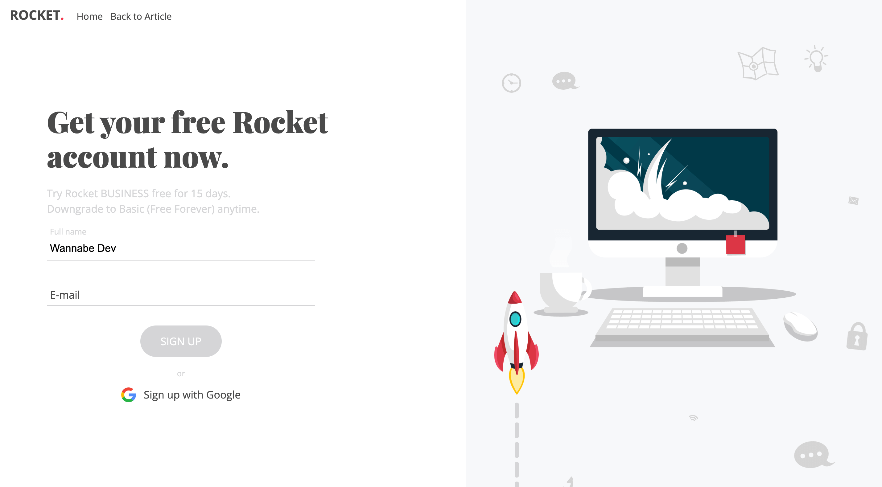
Today, we'll walk through the process of creating a sign-up form together, focusing on visualization, animation, and transition (call it whatever you like) of each step we take during the "registration". In this example, I've additionaly created a „dummy" validation for the form (not for production purposes), just to recognize which step is created/deleted, with another words which input field is filled or cleared and thus trigger the Greensock/GSAP Timeline forward or backward and perform our animations.

In addition to the already mentioned JavaScript and JavaScript animation library Greensock - GSAP, here we'll use simple HTML code - to create the skeleton and structure of our demo example, and simple CSS - to make it look pretty.
That's it for the introduction, perhaps a word or two too many... 😃 It's time to focus on what we're all here for, so let's get started...
HTML Structure
In the HTML code, you can see that our demo is composed of two main parts: one displaying the sign-up form and the other serving as a holder for all our "moving" animated elements.
Sign-Up Form
Here, in this part of the HTML code, everything should be more or less clear. In any case, below the code snippet, I will explain what we actually created with this code.
1<div class="container">
2  <!-- form-holder START -->
3  <div class="form-holder">
4
5    <!-- form-holder:form START -->
6    <form>
7
8      <!-- … -->
9
10      <div class="group">
11        <input type="text" name="fullname" id="fullname" required>
12        <label>Full name</label>
13      </div>
14
15      <div class="group">
16        <input type="text" name="email" id="email" required>
17        <label>E-mail</label>
18      </div>
19
20      <div class="submit">
21        <input type="submit" class="submit-btn" value="Sign up" disabled="disabled">
22
23        <!-- … -->
24      </div>
25
26    </form>
27    <!-- form-holder:form END -->
28
29  </div>
30  <!-- form-holder END -->
31</div>
To simplify the process, in our example, we'll only use two input fields: "Fullname" and "E-Mail". Of course, this is not a real-case scenario (!!!), but it will hopefully serve as a solid foundation for creating a larger, much better, and cooler sign-up forms. The animations we'll create for these two input fields today can, of course, be expanded and used according to your wishes and needs. You can animate and use 10, 100 or 1000 form fields if necessary. In addition to these two input fields, we have a "Submit" button, which we'll use to "create a profile" and trigger the final animation in the GreenSock timeline.
Holder for Animated Elements
The next part of the HTML code is a bit longer, but nothing spectacular happens in it. Really, nothing spectacular! Take a look at the code snippet and find a more detailed explanation below.
1<section class="sign-up">
2
3  <!-- form-holder:animations START -->
4    <div class="animated-bcg"></div>
5
6    <!-- form-holder:rocket START -->
7    <div class="animated-rocket">
8      <div class="dashed-line"></div>
9      <div class="rocket-holder">
10        <div class="rocket"></div>
11        <div class="fire fire-1"></div>
12        <div class="fire fire-2"></div>
13      </div>
14    </div>
15    <!-- form-holder:rocket END -->
16
17    <!-- form-holder:icons START -->
18    <div class="animated-icons">
19      <div class="icon lock"></div>
20      <div class="icon idea"></div>
21      <div class="icon cloud"></div>
22      <div class="icon cloud-2"></div>
23      <div class="icon clock"></div>
24      <div class="icon map"></div>
25      <div class="icon phone"></div>
26      <div class="icon post"></div>
27      <div class="icon wifi"></div>
28    </div>
29    <!-- form-holder:icons END -->
30  <!-- form-holder:animations END -->
31
32  <!-- … -->
33</section>
As I've mentioned before, this part of the code above serves as a container for many elements that we'll animate during the sign-up form. We'll label the div elements so that you can easily recognize what's going on. For example, the div with the class "animated-rocket" and all its child elements will serve as a container for the design elements of the rocket, the fire coming out of it, and the path along which it moves.
In addition to the rocket, there are also small icons that we'll animate using JavaScript - GSAP every time there's a change in the form. I've made an effort to name the classes in a way that saves you time searching for individual icons, such as "cloud", "phone", and so on. Each icon has its own div, so if you want to delete or add any of them, you can do so without much trouble.
You can edit the position or size of each icon through CSS, more on that in the following text. But... if you want to delete some of them in HTML, make sure to delete the corresponding CSS code responsible for that div. And vice versa, if you want to add new icons, besides adding a new div with a unique class, you must also add CSS code that will determine the position or size of the newly added element - the icon.
1<section class="sign-up">
2
3  <!-- … -->
4
5  <!-- progress-holder START -->
6  <div class="progress-holder">
7    <span class="point"></span>
8    <div class="success">
9      <div class="image">
10        <img src="assets/img/main.png" alt="wannabedev" />
11      </div>
12      <div class="message">
13        <h2>Your Rocket's account has been created.</h2>
14        <p>Check your mailbox, you should get the activation link shortly.</p>
15        <a href="https://wannabedev.io" class="back-btn">Back to homepage</a>
16      </div>
17    </div>
18  </div>
19  <!-- progress-holder END -->
20</section>
This part of the code served as a container for the final step of the animation, what will appear when the user fills out the form and clicks the "Submit" button. As an example, here we'll have a red dot placed in a div with the class "point," an image, and a text thanking for the registration - nothing unusual, a standard on every sign-up form. Of course, you can also modify this part of the code according to your own needs. Just don't forget, as I mentioned earlier, to also change the CSS and JavaScript code responsible for this part in parallel.
Designing the Form and Elements
Since in our example we have many small elements that we move, we'll have a lot of CSS code doing more or less the same job. When programming, it's best to use SASS, SCSS, and similar preprocessors (you probably already know and are familiar with this) to speed up your programming process - as we did locally. But as usual, in the demo, you'll only find CSS, so even beginners can easily orient themselves, and you experts can take the CSS code and use online converters to turn CSS into whatever you want.
Just as we did with the HTML code, here we'll also break down the CSS code into smaller parts and try to explain and understand each of them very quickly and easily.
1/* Styling for the sign-up form container */
2section.sign-up .container {
3  position: relative;
4  display: block;
5  width: 100%;
6  width: calc(100% - 32px);
7  max-width: 1360px;
8  height: 490px;
9  overflow: visible;
10  margin: 0 auto;
11  padding: 0 16px;
12  top: 50vh;
13  transform: translateY(-50%);
14  z-index: 25;
15}
16@media screen and (max-width: 640px) {
17  /* Media query for smaller screens */
18  section.sign-up .container {
19    margin-top: 128px;
20    height: 640px;
21    top: inherit;
22    transform: none;
23  }
24}
This CSS snippet styles the container for the sign-up form. It sets its position to relative and centers it vertically using the top and transform properties. The width is set to 100% with a maximum width of 1360px, and padding is added for spacing. On smaller screens (max-width: 640px), it adjusts the margin-top and height to accommodate the layout.
1/* Styling for the form holder */
2section.sign-up .container .form-holder {
3  position: relative;
4  display: block;
5  width: 50%;
6  height: auto;
7  overflow: hidden;
8  float: left;
9}
10@media screen and (max-width: 640px) {
11  /* Media query for smaller screens */
12  section.sign-up .container .form-holder {
13    width: 100%;
14  }
15}
16@media screen and (max-width: 640px) {
17  /* Media query for smaller screens */
18  section.sign-up .container .form-holder.mobile-helper {
19    height: 0px !important;
20    max-height: 0px !important;
21  }
22}
This CSS snippet styles the form holder within the container. It sets its position to relative and adjusts its width based on the screen size. On smaller screens (max-width: 640px), it sets the width to 100%. Additionally, it includes a media query to adjust the height of the form holder for smaller screens.
1/* Styling for the form title */
2section.sign-up .container .form-holder form h1 {
3  position: relative;
4  display: block;
5  width: 98%;
6  width: calc(100% - 16px);
7  max-width: 460px;
8  font-family: "Playfair Display", serif;
9  color: #4a4a4a;
10  font-size: 48px;
11  line-height: 56px;
12  padding: 0;
13  margin: 0;
14}
15@media screen and (max-width: 992px) {
16  /* Media query for smaller screens */
17  section.sign-up .container .form-holder form h1 {
18    font-size: 32px;
19    line-height: 40px;
20  }
21}
22@media screen and (max-width: 640px) {
23  /* Media query for smaller screens */
24  section.sign-up .container .form-holder form h1 {
25    font-size: 21px;
26    line-height: 29px;
27  }
28}
This CSS snippet styles the title (h1) of the form. It sets its position to relative and adjusts its width and font size based on the screen size using media queries.
1/* Styling for the input fields and labels */
2section.sign-up .container .form-holder form .group input {
3  background: transparent;
4  display: block;
5  width: 100%;
6  font-size: 17px;
7  padding: 10px 10px 10px 5px;
8  border: none;
9  border-bottom: 1px solid #d4d5d7;
10  transition: 0.35s ease all;
11}
12/* Styling for the input fields when focused */
13section.sign-up .container .form-holder form .group input:focus {
14  border-bottom: 1px solid #f4364c;
15  outline: 0px;
16}
17/* Styling for the labels */
18section.sign-up .container .form-holder form .group label {
19  position: absolute;
20  color: #4a4a4a;
21  pointer-events: none;
22  font-size: 17px;
23  left: 5px;
24  top: 10px;
25  transition: 0.35s ease all;
26}
These CSS snippets style the input fields and labels within the form. They set the input fields to have a transparent background, remove borders, and style the labels as absolute positioned elements. When an input field is focused, its border color changes. The labels transition smoothly when input fields are focused or have content.
1/* Styling for the submit button */
2section.sign-up .container .form-holder form .submit .submit-btn {
3  font-family: "Open Sans", sans-serif;
4  background: #f4364c;
5  position: relative;
6  display: inline;
7  width: auto;
8  height: auto;
9  font-size: 17px;
10  line-height: 17px;
11  padding: 16px 32px;
12  outline: 0px;
13  color: white;
14  text-transform: uppercase;
15  text-decoration: none;
16  border: none;
17  border-radius: 32px;
18  font-weight: 400;
19  cursor: pointer;
20  border: 1px solid #f4364c;
21  transition: 0.35s ease all;
22}
23/* Styling for the submit button on hover */
24section.sign-up .container .form-holder form .submit .submit-btn:hover {
25  opacity: 0.85;
26}
27/* Styling for the submit button when disabled */
28section.sign-up .container .form-holder form .submit .submit-btn:disabled,
29section.sign-up .container .form-holder form .submit .submit-btn[disabled] {
30  opacity: 1;
31  color: white;
32  border: 1px solid #d4d5d7;
33  background: #d4d5d7;
34}
These CSS snippets style the submit button within the form. They define its appearance, including background color, font size, padding, and border radius. Additionally, there are styles for hover and disabled states of the button.
1/* Styling for the Google sign-up link */
2section.sign-up .container .form-holder form .submit .google a {
3  color: #4a4a4a;
4  text-decoration: none;
5  outline: 0px;
6  transition: 0.35s ease all;
7}
8/* Styling for the Google sign-up link on hover */
9section.sign-up .container .form-holder form .submit .google a:hover {
10  color: #f4364c;
11}
12/* Styling for the Google sign-up link's image */
13section.sign-up .container .form-holder form .submit .google a span img {
14  position: relative;
15  display: inline-block;
16  width: 24px;
17  height: 24px;
18  margin-bottom: -6px;
19  margin-right: 8px;
20}
These CSS snippets style the Google sign-up link within the form. They set its color and define hover styles. Additionally, there are styles for the image within the link.
To save everyone time, we'll only display the CSS code and explain what we used to create the "thank you" screen that appears after clicking the "Submit" button. You can find all the code, as usual, on our GitHub page.
1/* Styling for the progress holder */
2section.sign-up .container .progress-holder {
3  position: relative;
4  display: block;
5  width: 50%;
6  height: auto;
7  overflow: visible;
8  float: left;
9  z-index: 8;
10}
11@media screen and (max-width: 640px) {
12  /* Media query for smaller screens */
13  section.sign-up .container .progress-holder {
14    width: 80%;
15    width: calc(100% - 128px);
16    margin: 0 auto;
17    float: none;
18    opacity: 0;
19    visibility: hidden;
20  }
21}
This CSS snippet styles the progress holder within the container. It sets its position to relative, display to block, and adjusts its width based on the screen size using a media query for smaller screens. It also sets the opacity to 0 and visibility to hidden for smaller screens.
1/* Styling for the progress point */
2section.sign-up .container .progress-holder span.point {
3  background-color: #f4364c;
4  position: absolute;
5  display: block;
6  width: 48px;
7  height: 48px;
8  border-radius: 24px;
9  top: 48px;
10  left: 50%;
11  margin-left: -16px;
12  opacity: 0;
13  visibility: hidden;
14}
This CSS snippet styles the progress point within the progress holder. It sets its position to absolute, background color, width, height, border radius, and adjusts its position relative to the progress holder.
1/* Styling for the success message */
2section.sign-up .container .progress-holder .success {
3  position: relative;
4  display: block;
5  width: 100%;
6  height: auto;
7  overflow: visible;
8  margin: 0 auto;
9}
This CSS snippet styles the success message within the progress holder. It sets its position to relative, display to block, and adjusts its width and overflow properties.
1/* Styling for the success message image */
2section.sign-up .container .progress-holder .success .image {
3  position: relative;
4  display: block;
5  width: 100%;
6  height: auto;
7  overflow: hidden;
8  margin-top: 32px;
9}
10section.sign-up .container .progress-holder .success .image img {
11  position: relative;
12  display: block;
13  width: 100%;
14  max-width: 480px;
15  height: auto;
16  margin: 0 auto;
17}
18@media screen and (max-width: 1248px) {
19  /* Media query for smaller screens */
20  section.sign-up .container .progress-holder .success .image img {
21    margin-right: -128px;
22  }
23}
24@media screen and (max-width: 640px) {
25  /* Media query for smaller screens */
26  section.sign-up .container .progress-holder .success .image img {
27    margin: 0 auto;
28    margin-top: 32px !important;
29  }
30}
These CSS snippets style the success message image within the progress holder. They set its position to relative, adjust its width and height to fit within the container, and incorporate media queries to modify the image margin for smaller screens.
1/* Styling for the success message text */
2section.sign-up .container .progress-holder .success .message {
3  position: relative;
4  opacity: 0;
5  visibility: hidden;
6}
7section.sign-up .container .progress-holder .success .message h2 {
8  font-family: "Playfair Display", serif;
9  color: #4a4a4a;
10  font-size: 19px;
11  line-height: 25px;
12  padding: 0;
13  margin: 0;
14  margin-top: 32px;
15  text-align: center;
16}
17section.sign-up .container .progress-holder .success .message p {
18  color: #4a4a4a;
19  padding: 0;
20  margin: 0;
21  margin-bottom: 32px;
22  text-align: center;
23}
24section.sign-up .container .progress-holder .success .message a.back-btn {
25  font-family: "Open Sans", sans-serif;
26  background: #f4364c;
27  position: relative;
28  display: block;
29  width: 154px;
30  height: auto;
31  font-size: 17px;
32  line-height: 17px;
33  padding: 16px 32px;
34  outline: 0px;
35  color: white;
36  text-transform: inherit;
37  text-decoration: none;
38  border: none;
39  border-radius: 32px;
40  font-weight: 400;
41  text-align: center;
42  margin: 0 auto;
43  cursor: pointer;
44  border: 1px solid #f4364c;
45  transition: 0.35s ease all;
46}
47section.sign-up .container .progress-holder .success .message a.back-btn:hover {
48  opacity: 0.85;
49}
These CSS bits make the success message look good in the progress holder. They make sure it's in the right place and control how see-through it is. Also, they make the heading, paragraph, and back button look nice in the message, keeping everything looking coordinated.
Are you still here? Phew, if you are, all good - we've survived the wilderness of CSS. 😃 Now we're turning to JavaScript code and what's actually more interesting in this whole story - GreenSock, GSAP timelines, and animations.
JavaScript and GSAP Magic
Here we will split the code into smaller parts and explain each of them enough for you to understand the gist of it. We won't delve into every line of code in detail, but if anything remains unclear and you need assistance, feel free to contact us, and we'll be there to help.
1const initializeRocketAnimation = () => {
2  // Initialize variables
3  const rocketTimelineStepFirst = gsap.timeline({ paused: true }),
4        rocketTimelineStepSecond = gsap.timeline({ paused: true }),
5        rocketTimelineStepLaunch = gsap.timeline({ paused: true }),
6        animatedRocket = document.querySelector('.animated-rocket'),
7        rocketHolder = document.querySelector('.rocket-holder'),
8        formHolder = document.querySelector('.form-holder'),
9        line = document.querySelector('.dashed-line'),
10        icon = document.querySelectorAll('.icon'),
11        form = document.querySelector('form'),
12        animatedBCG = document.querySelector('.animated-bcg'),
13        progressHolder = document.querySelector('.progress-holder'),
14        success = document.querySelector('.success'),
15        message = document.querySelector('.message'),
16        point = document.querySelector('.point'),
17        time = 0.75;
18
19  let fullnameHasValue = false,
20      emailHasValue = false;
21
22  // Simple validation function
23  const validate = () => {
24    const myInputs = document.querySelectorAll("input:not([type='submit'])");
25    const inputsWithValues = [...myInputs].filter(input => input.value).length;
26    document.querySelector("input[type=submit]").disabled = inputsWithValues !== myInputs.length;
27  };
28
29  // Event listeners for input changes
30  validate();
31  document.querySelectorAll('input').forEach(input => {
32    input.addEventListener('change', validate);
33    input.addEventListener('keyup', validate);
34    input.addEventListener('paste', validate);
35  });
36
37  // Fire animation function
38  const RocketFire = () => {
39    const fireTimeline = gsap.timeline();
40    fireTimeline
41      .to(".fire-1", { duration: 0.75, y: () => Random(-4, 4), rotation: () => Random(-2, 2), ease: 'sine.inOut', onComplete: RocketFire })
42      .to(".fire-2", { duration: 0.75, y: () => Random(-10, 6), rotation: () => Random(-2, 2), ease: 'sine.inOut', onComplete: RocketFire });
43  };
44
45  // Random function
46  const Random = (max, min) => Math.random() * (max - min) + min;
47
48  // Rocket animations - step #1
49  rocketTimelineStepFirst
50    .to(rocketHolder, { duration: time, y: -64, ease: 'back.out(1.7)' })
51    .to(line, { duration: time, height: '192px', ease: 'back.out(1.7)' }, `-=${time}`)
52    .to(icon, { duration: time, x: () => Random(-64, 64), y: () => Random(-64, 64), rotation: () => Random(-16, 16), stagger: `-=${time}` }, `-=${time}`);
53
54  // Rocket animations - step #2
55  rocketTimelineStepSecond
56    .to(rocketHolder, { duration: time, y: -128, ease: 'back.out(1.7)' })
57    .to(line, { duration: time, height: '256px', ease: 'back.out(1.7)' }, `-=${time}`)
58    .to(icon, { duration: time, x: () => Random(-128, 128), y: () => Random(-128, 128), rotation: () => Random(-16, 16), stagger: `-=${time}` }, `-=${time}`);
59
60  // Rocket animations - launch
61  rocketTimelineStepLaunch
62    // Animations for rocket launch and form transition
63    // ...
64};
65
66// Run the function when the DOM is ready
67document.addEventListener('DOMContentLoaded', initializeRocketAnimation);
This code initializes the rocket animation, handles input validation, defines animation timelines for different steps of the rocket animation, and sets up event listeners for input changes and form submission.
Variable Initialization: Initialize variables to select elements from the DOM and set up GSAP timelines. Declare boolean variables for input validation.
Validation Function:
Define a function named validate to check if input fields have values. Disable the submit button if any input field is empty. Attach the function to input change events.
Event Listeners for Input Changes:
Execute the validate function and attach it to input change, keyup, and paste events.
Fire Animation Function:
Define the RocketFire function to animate the fire effect of the rocket. Create a GSAP timeline for fire animation, which recurses upon completion for a continuous effect.
Random Function:
Define the Random function to generate random numbers within a given range.
Rocket Animations - Step #1 and Step #2: Set up GSAP timelines for step 1 and step 2 animations of the rocket and related elements. Include animations for rocket movement, dashed line height adjustment, and icon positions with random variation.
Rocket Animations - Launch: Set up a timeline for the final launch animation of the rocket. Include animations for rocket movement off-screen, dashed line extension, icon movements, form and rocket opacity changes, background animation, and transition to the success message.
DOM Content Loaded Event Listener:
Add an event listener for the DOMContentLoaded event to execute the initializeRocketAnimation function once the DOM content is loaded.
1// Change value of the first input
2  document.getElementById("fullname").addEventListener("input", function () {
3    if (this.value) {
4      if (emailHasValue) {
5        rocketTimelineStepSecond.play();
6      } else {
7        rocketTimelineStepFirst.play();
8      }
9      fullnameHasValue = true;
10    } else {
11      if (emailHasValue) {
12        rocketTimelineStepSecond.reverse();
13      } else {
14        rocketTimelineStepFirst.reverse();
15      }
16      fullnameHasValue = false;
17    }
18  });
19
20  // Change value of the second input
21  document.getElementById("email").addEventListener("input", function () {
22    if (this.value) {
23      if (fullnameHasValue) {
24        rocketTimelineStepSecond.play();
25      } else {
26        rocketTimelineStepFirst.play();
27      }
28      emailHasValue = true;
29    } else {
30      rocketTimelineStepSecond.reverse();
31      if (fullnameHasValue) {
32        rocketTimelineStepSecond.reverse();
33      } else {
34        rocketTimelineStepFirst.reverse();
35      }
36      emailHasValue = false;
37    }
38  });
39
40  // Submit button event listener
41  document.querySelector('.submit-btn').addEventListener('click', function (e) {
42    e.preventDefault();
43    rocketTimelineStepLaunch.play();
44  });
45};
These sections handle input changes for the "Fullname" and "E-Mail" fields, triggering the appropriate rocket animation steps based on the input values. Additionally, there's an event listener for the submit button to trigger the final rocket launch animation when clicked.
First Input Change Event Listener:
Listen for input changes in the "fullname" input field. If the field has a value, play the appropriate rocket animation based on the state of the email input. Update the fullnameHasValue variable accordingly.
Second Input Change Event Listener:
Listen for input changes in the "email" input field. If the field has a value, play the appropriate rocket animation based on the state of the fullname input. Update the emailHasValue variable accordingly.
Submit Button Event Listener: Listen for clicks on the submit button. Prevent the default form submission behavior. Play the rocket launch animation timeline.
1// Run the function when the DOM is ready
2document.addEventListener('DOMContentLoaded', initializeRocketAnimation);
This section ensures that the initializeRocketAnimation function runs when the DOM content is fully loaded, allowing the JavaScript code to interact with and manipulate the HTML elements effectively.
I hope we've all reached this point together and now know how to easily create a visualization for a sign-up form. Feel free to tell your friends how cool wannabedev.io is and invite them to visit us, follow us on social media, or even better, find us on GitHub and make our code snippets even better with your ideas and your code.
Greetings. 😊
Credits
- The inspiration for effects and Layout comes from Matt Koziorowski
- GSAP by Greensock
- Rocket and computer icons created by freepik.com