Unique Blob Cursor with Background Images
Every day, we, as web developers and designers, are in search of new ways to engage users who visit our website and creatively attract new clients. Not all methods are successful (maybe not even this one), but trying again and again is not prohibited.
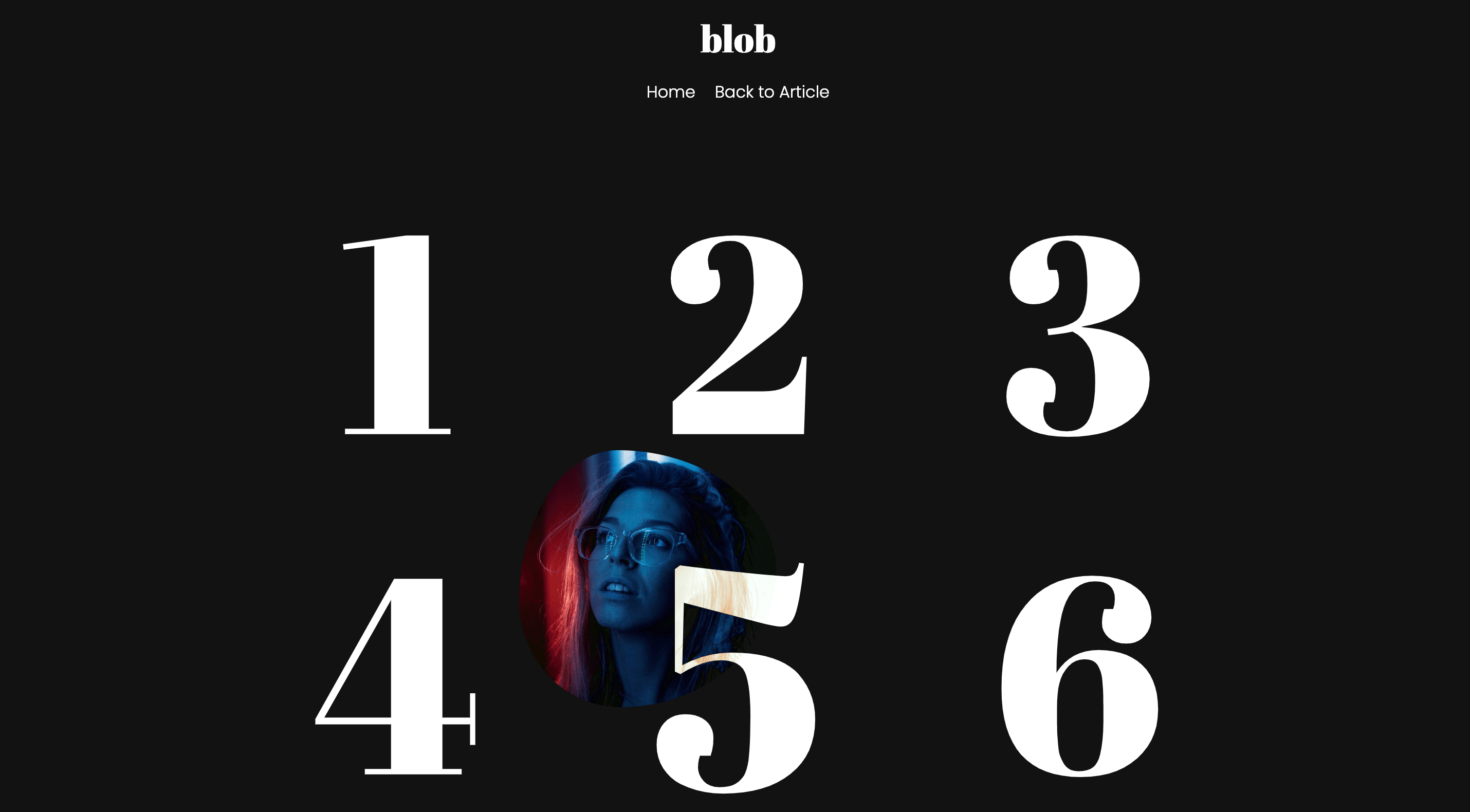
In one of my previous projects for a client, we had the task of presenting a gallery of images in an interesting way, where the images should only appear on hover. In our quest for the best solution, we accidentally "discovered" this, and as far as the client was concerned, the solution was a real hit.
We received various inquiries, such as: How did you do this? It must have been complicated to program something like that, right? And similar questions. So, to not leave you in suspense, I want to answer those questions right away. It's programmed with JavaScript and creating something like this is entirely uncomplicated.
So, let's get started...
The HTML Structure
First, let's take a look at the HTML structure that serves as the foundation for our gallery and blob cursor with background images:
1<div id="cursor-blob"></div>
2
3<!-- ... -->
4
5<section class="blob">
6  <ul class="nav">
7    <li class="nav_link" data-bcg="assets/img/img-1.jpeg"><span>1</span></li>
8    <li class="nav_link" data-bcg="assets/img/img-2.jpeg"><span>2</span></li>
9    <li class="nav_link" data-bcg="assets/img/img-3.jpeg"><span>3</span></li>
10    <li class="nav_link" data-bcg="assets/img/img-4.jpeg"><span>4</span></li>
11    <li class="nav_link" data-bcg="assets/img/img-5.jpeg"><span>5</span></li>
12    <li class="nav_link" data-bcg="assets/img/img-6.jpeg"><span>6</span></li>
13  </ul>
14</section>
The HTML code <div id="cursor-blob"></div> represents a <div> element with the ID "cursor-blob". This div element is intended to serve as our cursor pointer on the webpage.
In addition, we have a container section.blob that contains a list of navigation links, in other words, our gallery - ul.nav. Each link, li.nav_link, has a background image defined by data-bcg and a number indicator within a span element to show its position.
The CSS Styling
The CSS provided is used to style an HTML element with the ID "cursor-blob", which is our cursor.
1#cursor-blob {
2  top: 18px;
3  left: 50%;
4  margin-left: -25px;
5  width: 50px;
6  height: 50px;
7  background: linear-gradient(120deg, #ffffff, #dfe6e9, #b2bec3, #636e72, #2d3436);
8  -webkit-background-size: cover !important;
9  -moz-background-size: cover !important;
10  -o-background-size: cover !important;
11  background-size: cover !important;
12  position: absolute;
13  mix-blend-mode: difference;
14  pointer-events: none;
15  z-index: 1;
16  transition: all 0.15s linear, opacity 0.7s linear, scale 0.7s linear;
17  animation: blobRadius 5s ease infinite, blobBackground 15s ease infinite;
18}
19#cursor-blob.active {
20  opacity: 1;
21  transform: scale(15) !important;
22}
23@media screen and (max-width: 768px) {
24  #cursor-blob.active {
25    transform: scale(7) !important;
26  }
27}
28
29@keyframes blobRadius {
30  0%, 100% {
31    border-radius: 43% 77% 80% 40%/40% 40% 80% 80%;
32  }
33  20% {
34    border-radius: 47% 73% 61% 59%/47% 75% 45% 73%;
35  }
36  40% {
37    border-radius: 46% 74% 74% 46%/74% 58% 62% 46%;
38  }
39  60% {
40    border-radius: 47% 73% 61% 59%/40% 40% 80% 80%;
41  }
42  80% {
43    border-radius: 50% 70% 52% 68%/51% 61% 59% 69%;
44  }
45}
46@keyframes blobBackground {
47  0%, 100% {
48    background-position: 0% 50%;
49  }
50  50% {
51    background-position: 100% 50%;
52  }
53}
In our web design, we've incorporated several key features into the "cursor-blob" element. First, we've positioned it initially 18 pixels from the top of the viewport and centered it horizontally by setting left: 50%. To achieve perfect horizontal alignment, we've adjusted the margin-left by -25 pixels, effectively centering it relative to its own width. This results in a fixed size of 50 pixels for both the width and height, creating a square shape.
The "cursor-blob" also boasts a dynamic background, utilizing a linear gradient. This gradient seamlessly transitions through a range of colors, delivering a visually cool effect. The specific shades and colors of the gradient are defined through the background property.
To maintain control over its position and interaction, we've applied the position: absolute property, ensuring precise placement on the page. Furthermore, we've used mix-blend-mode: difference to give it a unique blending mode, allowing it to interact distinctively with other elements on the page. Importantly, we've made it non-interactive by setting pointer-events: none, preventing it from responding to mouse events such as clicks or hover.
For layering and visibility, we've assigned it a z-index of 1, guaranteeing that it remains on top of other elements on the page. This property dictates the order in which elements are stacked visually.
We've also included transition effects, shaping how the element changes over time. The transition property controls the transitions of "all" properties over a duration of 0.15 seconds with a linear effect. Additionally, we've specified transitions for "opacity" and "scale" properties over a 0.7-second duration with linear transitions.
Our "cursor-blob" element comes to life through keyframe animations. Two animations are applied: "blobRadius" and "blobBackground". "blobRadius" dynamically changes the element's border-radius, resulting in captivating shape transformations. Meanwhile, "blobBackground" adjusts the background position, creating an animated shifting gradient effect.
To guarantee that the "cursor-blob" fits well on smaller screens, such as mobile devices, we've made it slightly smaller. This adjustment maintains a pleasing appearance regardless of the screen size.
In conclusion, our CSS code aims to fascinate and involve visitors by producing an attention-grabbing and interactive cursor effect on our website. This is accomplished through a blend of styling attributes, animations, and transitions, resulting in this lively presentation.
These styles play a vital role in creating a nice user interface of our "gallery".
1section.blob {
2  position: relative;
3  display: block;
4  width: 100vw;
5  max-width: 100vw;
6  height: auto;
7  min-height: 100vh;
8  overflow: hidden;
9}
10section.blob .nav {
11  position: relative;
12  display: block;
13  width: 100vw;
14  max-width: 992px;
15  height: auto;
16  margin: 0 auto;
17  padding: 0;
18  top: 42vh;
19  transform: translateY(-50%);
20  overflow: hidden;
21}
22@media screen and (max-width: 768px) {
23  section.blob .nav {
24    top: inherit;
25    transform: none;
26    margin-top: 32px;
27  }
28}
29section.blob .nav_link {
30  position: relative;
31  display: block;
32  width: 27.3333333%;
33  height: auto;
34  color: #fff;
35  list-style: none;
36  cursor: none;
37  font-size: 33.333333vh;
38  line-height: 33.333333vh;
39  font-family: "Abril Fatface", cursive;
40  transition: 0.25s ease;
41  float: left;
42  margin: 3%;
43  text-align: center;
44}
45@media screen and (max-width: 768px) {
46  section.blob .nav_link {
47    width: 100%;
48  }
49}
50section.blob .nav_link span {
51  z-index: 0;
52}
53section.blob .nav_link:hover {
54  transform: scale(1.15);
55}
We, in our CSS code, utilize the section.blob selector to target a <section> element with the class "blob". We set the position to relative, allowing for positioning adjustments, and define it as a block-level element with a width of 100% of the viewport width (100vw). This ensures that it spans the entire width of the viewport. Furthermore, we set max-width to 100vw to prevent the element from exceeding the viewport width. We establish the height as "auto", allowing it to adapt to its content. To ensure that it takes at least the full height of the viewport, we set min-height to 100% of the viewport height (100vh).
Within the confines of this "blob" section, we have a nested element with the class "nav". We position it relative to its parent, making it a block-level element with a width of 100%, but we limit it to a maximum width of 992 pixels. The height is set to "auto", and we center it horizontally within its parent using margin: 0 auto. We utilize top and transform properties to vertically align it in the middle of the "blob" section, and we ensure that any overflowing content is hidden.
For screens with a maximum width of 768 pixels, we make necessary adjustments to the positioning of the "nav" element. We reset the top and transform properties, and we set margin-top to 32 pixels, effectively repositioning it.
Within the "nav" element, we introduce elements with the class "nav_link". These are block-level elements with a specific width, specifically 27.3333333% of their parent's width. We give them a distinct text color, define font properties, and apply a transition effect. On larger screens, we float them to the left with a margin of 3% and center their text.
For screens with a maximum width of 768 pixels, we adjust the width of "nav_link" elements to 100%, effectively making them span the entire width.
Lastly, when users hover over a "nav_link" element, we make it scale up by 15%, creating a subtle interactive effect.
The JavaScript Magic
The provided JavaScript code is responsible for adding interactivity to a gallery, primarily concerning cursor behavior and animations.
1imagesLoaded( '.blob', { background: true }, function() {
2
3  // loaded
4  document.querySelector('.loader').classList.add("is-loaded");
5
6  // demo
7  const blobCursor = (() => {
8    const CURSOR = document.querySelector('#cursor-blob');
9    const LINKS = document.querySelectorAll('.nav_link');
10    const setCursorPos = (e) => {
11      const {
12        pageX: posX,
13        pageY: posY
14      } = e;
15      CURSOR.style.top = `${posY - (CURSOR.offsetHeight / 2)}px`;
16      CURSOR.style.left = `${posX - (CURSOR.offsetWidth / 2)}px`;
17    };
18    document.addEventListener('mousemove', setCursorPos);
19
20    // mouse over
21    LINKS.forEach(link => link.addEventListener('mouseover', function() {
22      CURSOR.style.transform = 'scale(5)',
23      CURSOR.style.background = "url('" + link.dataset.bcg + "') no-repeat center center"
24    }));
25
26    // mouse leave
27    LINKS.forEach(link => link.addEventListener('mouseleave', function(event) {
28      CURSOR.style.transform = '',
29      CURSOR.style.background = '',
30      CURSOR.classList.remove("active");
31    }));
32
33    // mouse click
34    LINKS.forEach(link => link.addEventListener('click', function() {
35      CURSOR.style.transform = 'scale(15)'
36      CURSOR.classList.add("active");
37    }));
38
39  })();
40
41});
We initiate our functionality by utilizing the imagesLoaded library to confirm the successful loading of images within the HTML element that has the class "blob". Once all the images are loaded, we trigger a function. Within this function, we execute several actions:
-
We identify an HTML element with the class "loader" and append the "is-loaded" class to it. This serves as an indicator that the webpage has finished loading.
-
We define a self-invoking function called
blobCursorto encapsulate cursor-related functionality. This function selects two elements: one with the ID "cursor-blob" and all elements with the class "nav_link". -
Inside
blobCursor, we introduce thesetCursorPosfunction, which is responsible for tracking and setting the cursor's position based on the mouse's coordinates. It computes the cursor's position relative to the mouse pointer and updates the "top" and "left" properties accordingly. -
To monitor mouse movement, we attach an event listener to the entire document, specifically listening for the "mousemove" event. This listener invokes the
setCursorPosfunction, ensuring the cursor's position follows the movement of the mouse. We provide special interactions with links having the class "nav_link". -
When the user hovers over one of these links, we transform the cursor to a larger size using the "scale(5)" transformation, and we set its background to an image specified in the link's data attribute
link.dataset.bcg. This creates a visual effect that enhances user interaction with the links. -
In the event of the mouse leaving a link (mouse leave), we reset the cursor to its original state by clearing the "transform" and "background" properties, and we remove the "active" class from the cursor element.
-
Moreover, when a user clicks on a link, we scale the cursor further with "scale(15)", and we add the "active" class to the cursor element, likely indicating an active selection or interaction with the link.
I hope you've enjoyed this blob cursor tutorial, and maybe you'll also impress your clients just as I have impressed mine.
Best regards, and until next time.
Credits
- imagesLoaded by David DeSandro
- Images by Unsplash.com
- Fonts Poppins and Abril Fatface by Google Fonts
- Simple Loader by loading.io