Navigation in Print Media Style
Hello everyone! 👋 In this tutorial, I'll guide you through the process of creating a unique and creative navigation animation using HTML, CSS, and JavaScript, to be precise, the JavaScript animation library GreenSock (GSAP). We're designing our navigation to look like it's printed on paper, so it'll be easy to read and use.
HTML Structure
Let's start with the HTML structure. We have a section for our products, containing a navigation bar and individual product items. Here's the basic setup:
1<!-- Main Product Section -->
2<section class="product-section">
3
4 <!-- Navigation Icon -->
5 <div class="navigation-icon">
6 <div class="hamburger-menu">
7 <div class="menu-line line-1"></div>
8 <div class="menu-line line-2"></div>
9 <div class="menu-line line-3"></div>
10 </div>
11 </div>
12
13 <!-- Product Cards Container -->
14 <div class="product-cards-container">
15
16 <!-- Product Card 1 - Duststrom -->
17 <div class="product-card duststrom">
18 <div class="product-card-inner">
19 <h2 class="product-title">
20 <a class="product-link" href="https://wannabedev.io/tutorials/navigation-in-print-media-style">
21 <span class="product-number">01</span><small class="product-category">Armwear</small>
22 </a>
23 </h2>
24 <ul class="product-social-icons">
25 <!-- Social Media Icons -->
26 <li>
27 <a href="#!">
28 <svg class="facebook-icon" ... ></svg>
29 </a>
30 </li>
31 <li>
32 <a href="#!">
33 <svg class="twitter-icon" ... ></svg>
34 </a>
35 </li>
36 <li>
37 <a href="#!">
38 <svg class="google-icon" ... ></svg>
39 </a>
40 </li>
41 </ul>
42 </div>
43 </div>
44
45 <!-- Product Card 2 - Parrotpink -->
46 <div class="product-card parrotpink">
47 <!-- ... (Similar structure as above) -->
48 </div>
49
50 <!-- Product Card 3 - Raspberryrose -->
51 <div class="product-card raspberryrose">
52 <!-- ... (Similar structure as above) -->
53 </div>
54
55 <!-- Product Card 4 - Burgundy -->
56 <div class="product-card burgundy">
57 <!-- ... (Similar structure as above) -->
58 </div>
59
60 <!-- products:products:product START -->
61 <div class="product zinnwalditebrown active">
62 <!-- ... (Similar structure as above) -->
63 </div>
64
65 </div>
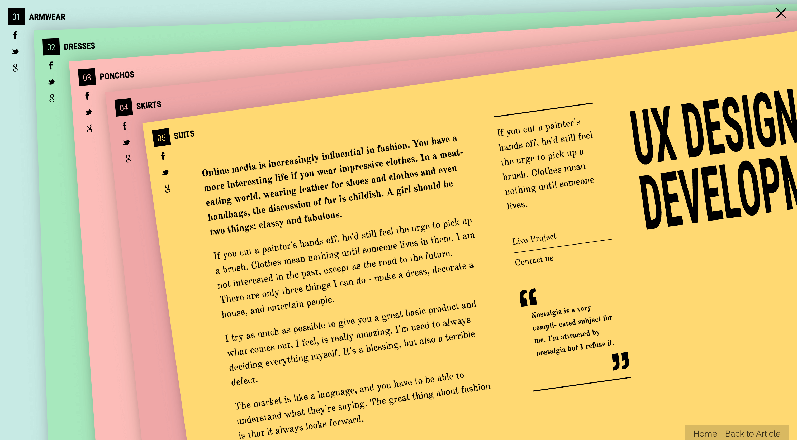
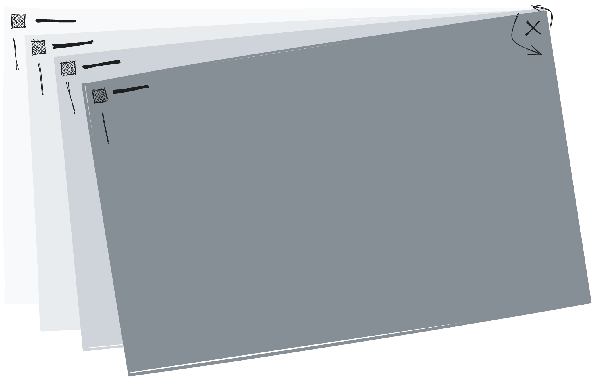
66</section>The navigation icon is held within a container called navigation-icon. Inside this container, three lines called menu-line make up the actual navigation icon, which we call the hamburger-menu. When you click on the navigation icon, the active class will be added to the hamburger div. This switching of classes is done using JavaScript, and other properties like position are controlled by CSS.
Each product card is assigned a class called product-card. This class is followed by a distinctive name like duststrom, parrotpink etc., which corresponds to the card's color theme. To make it easier to identify different parts of the product card, we use more specific class names like product-card-inner, product-title, product-link, and product-social-icons. This way, you can easily modify or add new classes to suit your project's needs.
CSS Styling
Let's make our website look more attractive with some easy CSS techniques. We'll concentrate on the navigation and product areas, and I'll explain each step in simple terms. We won't need any complicated language; we'll just use plain CSS techniques that are easy to understand.
Navigation
This CSS code makes a hamburger icon menu, which is often used on websites that work well on smaller screens. It uses CSS properties to change the size, position, and color of the icon so that it's easy to look at and use. The code is simple and easy to understand, and you can change it to fit your website's needs.
1.section.products .navigation {
2  position: fixed;
3  display: block;
4  width: 28px;
5  height: 24px;
6  top: 16px;
7  right: 16px;
8  z-index: 100;
9}
10
11.section.products .navigation .hamburger {
12  cursor: pointer;
13  width: 26px;
14  height: 18px;
15  position: relative;
16  display: block;
17}
18
19.section.products .navigation .hamburger .line {
20  display: block;
21  background: black;
22  width: 26px;
23  height: 2px;
24  position: absolute;
25  right: 0;
26  transition: all 0.4s;
27}
28
29.section.products .navigation .hamburger:hover .line-1, .section.products .navigation .hamburger:focus .line-1 {
30  transform: translateY(-1px);
31}
32
33.section.products .navigation .hamburger:hover .line-3, .section.products .navigation .hamburger:focus .line-3 {
34  transform: translateY(1px);
35}
36
37.section.products .navigation .hamburger.active .line-1 {
38  transform: translateY(9px) translateX(0) rotate(45deg);
39  width: 26px;
40}
Let's go through the main points:
Position and Size: The navigation bar stays in one place on the screen and takes up 28 pixels by 24 pixels. It's placed 16 pixels from the top and right edges of the screen. It's also set to a high z-index so it stays above other elements on the page.
Hamburger Icon Looks: The hamburger icon in the navigation has a pointer cursor, is 26 pixels wide, and 18 pixels tall. It's placed relative to the navigation bar and is displayed as a block.
Hamburger Lines: The lines of the hamburger icon are styled within a black background container. Each line is 26 pixels wide and 2 pixels tall, and they're positioned absolutely next to the container. There's a smooth animation effect for style changes that takes 0.4 seconds.
Hover and Focus Changes: When you hover over or focus the hamburger icon, the first line (line-1) moves up by 1 pixel and the third line (line-3) moves down by 1 pixel. This creates a subtle animation that looks like you're pressing a button.
Active State: If the hamburger icon is active (e.g., clicked), the first line (line-1) gets transformed to look like an X or close icon. The first line's width is also set to 26 pixels during this transformation.
Products
This CSS code makes sure that product elements look good and work well on screens of all sizes, including smaller devices. It's carefully designed to adjust the placement, size, and appearance of the elements so that the product section looks consistent and attractive on all kinds of devices.
1.section.products .product {
2  position: absolute;
3  display: block;
4  width: 100%;
5  height: 100%;
6  top: 0;
7  right: 0;
8  bottom: 0;
9  left: 0;
10  -webkit-box-shadow: 0 -7px 31px rgba(0, 0, 0, 0.15), 0 7px 15px rgba(0, 0, 0, 0.11);
11  box-shadow: 0 -7px 31px rgba(0, 0, 0, 0.15), 0 7px 15px rgba(0, 0, 0, 0.11);
12  transition: box-shadow 0.4s;
13  overflow-y: auto;
14}
15
16.section.products .product .product-inner {
17  padding: 16px;
18}
19
20.section.products .product .product-inner h2 {
21  position: absolute;
22  display: block;
23  font-family: "Roboto Condensed", sans-serif;
24  font-size: 16px;
25  line-height: 34px;
26  font-weight: 700;
27  text-transform: uppercase;
28  margin: 0;
29  padding: 0;
30  z-index: 2;
31  width: 148px;
32}
33
34@media screen and (max-width: 768px) {
35  .section.products .product .product-inner h2 {
36    width: 120px;
37    transform: rotate(90deg);
38    top: 56px;
39    left: -30px;
40  }
41}
Let's break down the key aspects:
Product Container: The product element is positioned absolutely and occupies the entire viewport. It has a block display, and its dimensions are set to 100% width and height, with positioning from all edges (top, right, bottom, left) set to 0.
Box Shadow and Transition: The product element has a box shadow applied, providing a visual depth effect when the product is displayed. There is a smooth transition effect of 0.4 seconds applied to the box shadow property.
Inner Content Styling: The inner content of the product has 16px of padding.
Heading (h2) Styling: The heading inside the product has a specific styling. It is absolutely positioned and displayed as a block. It uses the "Roboto Condensed" font family and has a font size of 16px, line height of 34px, and a font weight of 700. Text is transformed to uppercase, and a width of 148px is set. The z-index property is set to 2, which implies it's positioned above other elements.
Responsive Styling: For screens with a maximum width of 768px (e.g., smaller devices), additional styling is applied. The width of the heading is adjusted to 120px, and it is rotated 90 degrees. It is also repositioned with top: 56px and left: -30px, creating a specific layout for smaller screens.
A little bit of JavaScript
The code begins by initializing GSAP timelines (tl and tlContent) and selecting key DOM elements using document.getElementById and document.querySelector. The selected elements include the hamburger icon (hamburger), a link (link), an array of products (product), and the body of the document (body).
1// Initialize GSAP timelines and elements
2const tl = gsap.timeline({ paused: true, reversed: true });
3const tlContent = gsap.timeline();
4const hamburger = document.getElementById('hamburger');
5const link = document.querySelector('h2 a');
6const product = document.querySelectorAll('.product');
7const body = document.body;
The tlContent timeline is utilized to create a smooth fade-in effect for the body content. The opacity of the body element is animated from 0 to 1 over a duration of 1 second, making the content gradually visible.
1// FadeIn body content on load
2tlContent.to(body, { duration: 1, opacity: 1, visibility: 'visible' });
The tl timeline is responsible for animating the navigation of .product elements. It defines a series of transformations for each product, including translation (x and y), rotation, and staggering effects. The animation has a duration of 0.75 seconds with a power4 easing function and a staggered start for each product.
1// Navigation animation for '.product' elements
2tl.to(product, {
3  duration: 0.75,
4  ease: 'power4.out',
5  stagger: -0.125,
6  transformOrigin: 'right top',
7  x: (index, target) => target.dataset.index * 64,
8  y: (index, target) => target.dataset.index * 6,
9  rotation: (index, target) => target.dataset.index * -2
10});
An event listener is set up for the DOMContentLoaded event, triggering the tlContent timeline to play. We make sure the website is finished loading before making the body content appear. This way, the content doesn't appear too soon or too late, which makes for a better user experience.
1// Play content animation on DOMContentLoaded event
2document.addEventListener('DOMContentLoaded', () => tlContent.play());
A click event listener is attached to the hamburger icon (hamburger). When clicked, it toggles the play state of the tl timeline, either playing it forward or in reverse. Additionally, the active class is toggled on the hamburger element, indicating the state of the navigation menu.
1// Toggle navigation menu on hamburger click
2hamburger.addEventListener('click', () => {
3  tl.reversed() ? tl.play() : tl.reverse();
4  hamburger.classList.toggle('active');
5});
An event listener is added to the link (link). Upon a click, it prevents the default behavior and retrieves the target href. The tl timeline is then reversed with an increased speed (timeScale(2)), creating an animation of products returning to their original state. Simultaneously, the body's opacity is animated to 0, and after a delay of 2.5 seconds, the page is redirected to the target href. This produces a transition effect during page navigation.
1// Link click event for page transition animation
2link.addEventListener('click', function linkClicked(event) {
3  // Prevent default click event across multiple browsers
4  event.preventDefault();
5
6  // Get the target href
7  const thisHref = this.getAttribute('href');
8
9  // Reverse the main timeline and fade out body
10  tl.reverse().timeScale(2);
11  gsap.to('body', { duration: 1, opacity: 0, onComplete: () => window.location = thisHref, onCompleteParams: [thisHref], delay: 2.5 });
12});
I hope you've enjoyed this tutorial and learned some valuable skills along the way. Now it's time to put your knowledge into practice! Explore the demo I provided and feel free to customize it to your liking or needs.
If you find any bugs or have ideas to improve the code, feel free to contribute to the project on GitHub. Your input is always important to us, it's only right way to improve open-source projects and making it even cooler.
Happy coding! 😊
Credits
- GSAP by Greensock
- Fashion Ipsum by Bill Karkavos