Multipurpose Table with Animated Collapsible Columns
Hi, devs! After a short break, we're hanging out again. I hope you're ready, because this time we'll try to nicely design and then animate an HTML table. 😊
Although HTML tables are mostly a pain in the neck, often boring, sometimes challenging to design, or complicated when it comes to responsive design... it doesn't always have to be the case!
As I mentioned before, today our goal will be to create a multipurpose table with collapsible columns using HTML, CSS, and JavaScript + GSAP (sorry, GSAP again - what can we do when we're in love with this library 😊)... and I'm sure, after this tutorial, you'll never look at HTML tables the same way.
Let's get started...
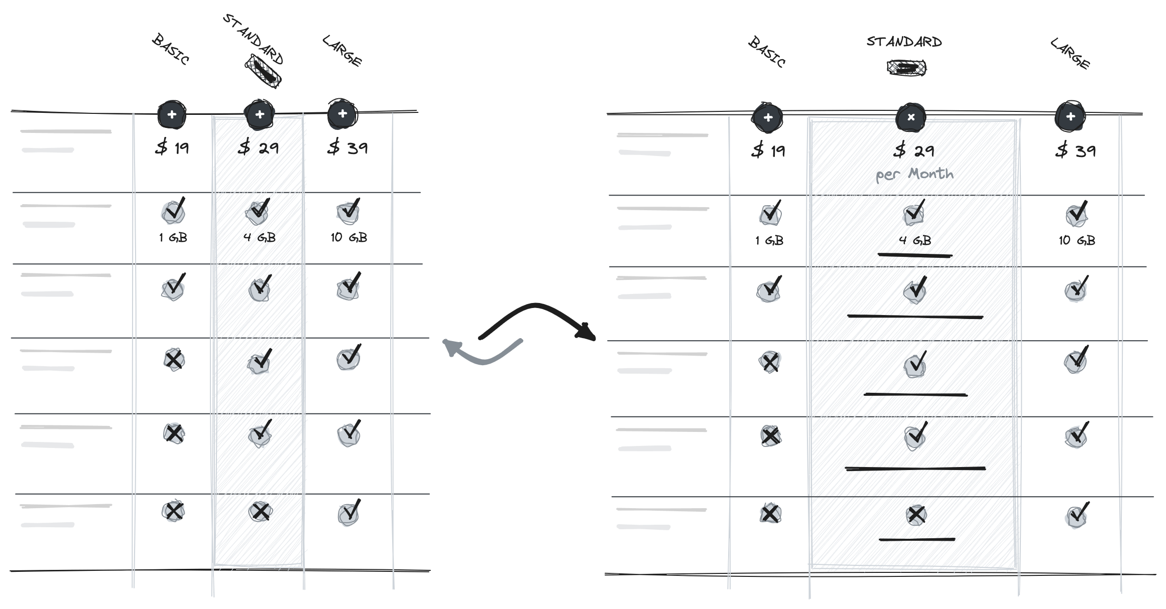
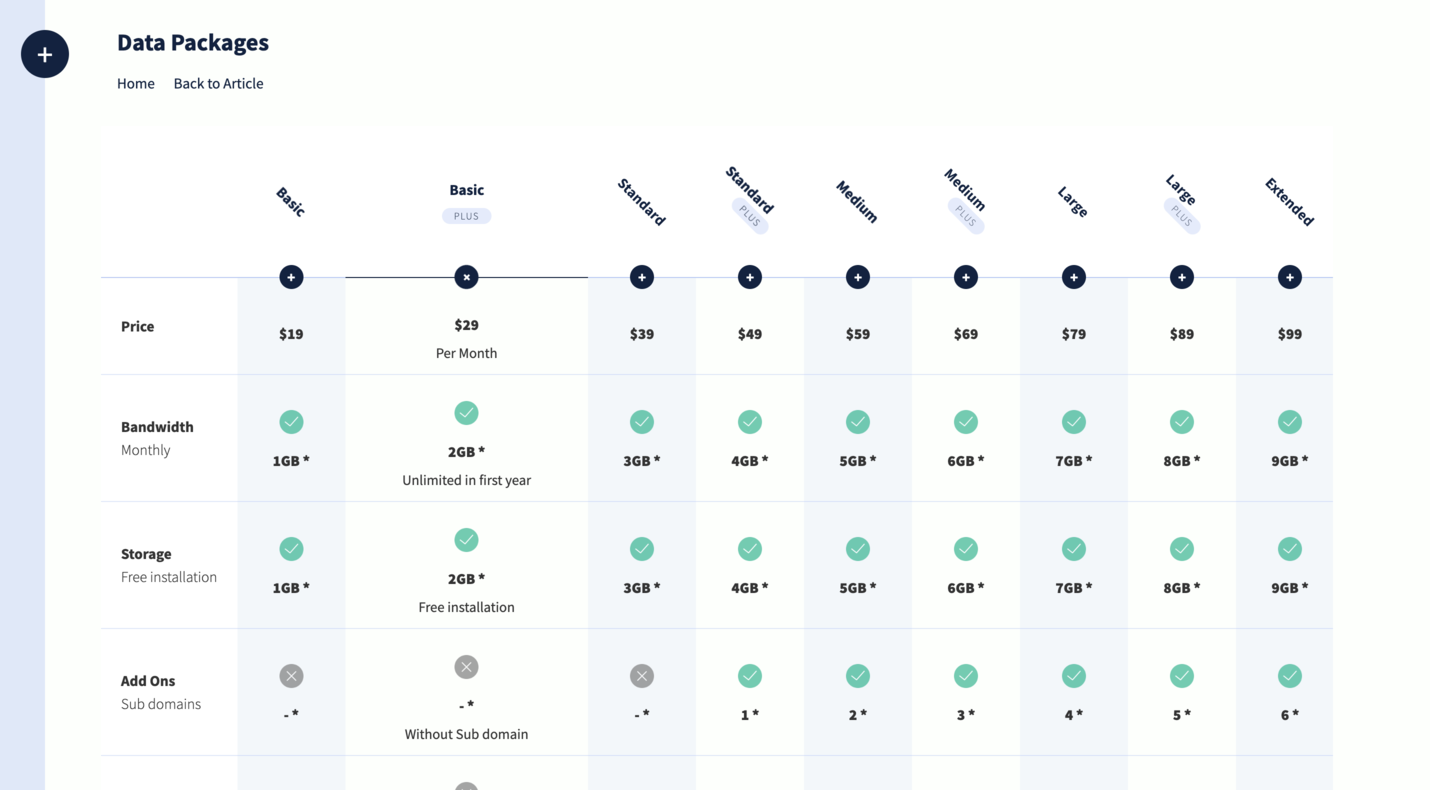
As you can see in the sketch above, our table will consist of a main column that will be fixed horizontally, and other columns that will have expandable/closable functionality. Our goal is to display as much information as possible on load through the table and provide the ability to store and display more detailed information, which will only appear when the user clicks on one of the table headers.
HTML Structure
The HTML element known as <table> is used to display data in a structured format. It organizes information into a grid-like structure consisting of rows and columns, where each cell holds specific data.
1<section class="table-wrapper">
2  <table>
3    <thead>
4      <tr>
5        <th></th>
6        <th class="trigger">
7          <p>Basic</p>
8        </th>
9        <th class="trigger">
10          <p>Basic</p>
11          <span>plus</span>
12        </th>
13        <!-- More table headers... -->
14      </tr>
15    </thead>
16    <tbody>
17      <tr>
18        <td>
19          <p><strong>Price</strong></p>
20        </td>
21        <td>
22          <p>$19</p>
23          <span>Per Month</span>
24        </td>
25        <!-- More table data... -->
26      </tr>
27      <!-- More table rows... -->
28    </tbody>
29  </table>
30</section>
That is the case with us as well. Our table is wrapped in a <section> element with the class "table-wrapper", and within that section, the table starts with the <table> element.
The table consists of a header section marked by the <thead> element. Inside the header, there is a single row represented by the <tr> element. Each table header is indicated by the <th> element. Each <th> element has a combination of text and additional markup such as <p> and <span>.
After the header, the body of the table is defined using the <tbody> element. The body contains multiple rows, each represented by a <tr> element.
Each row in the table body has a series of cells indicated by the <td> elements. The cells contain various demonstration data, such as price information, bandwidth, storage details, add-ons, database support, and backup options. These data are structured using a combination of text, <p> elements for paragraphs, and <span> elements for additional information. Some cells also include <img> elements with corresponding classes and alternative text.
Design and styles for our tutorial
We won't display the CSS code in this article to avoid unnecessary cluttering with such extensive CSS styles. Nevertheless, I want to emphasize that the CSS part holds significant value in creating this tutorial, and don't forget to take a look at that section. Of course, if you wish to download the code and improve it or change the design, you'll need to make some modifications or updates to the CSS code as well.
JavaScript functionality
First, we will create an arrow function and name it simply initTable().
1const initTable = () => {
2  const tableWrapper = document.querySelector('.table-wrapper');
3  const loader = document.querySelector('.loader');
4  const triggers = document.querySelectorAll('.trigger');
5  const tableRows = document.querySelectorAll('tbody tr');
6
7  // ...
8
9};
Inside the function, we will first initialize the variables that we will later need in the code: tableWrapper, loader, triggers (elements that trigger animations), and table rows. We will use the querySelector and querySelectorAll methods to select the desired elements.
Then, we call the imagesLoaded function with tableWrapper as an argument. This means that the function will wait for the images inside the table wrapper to finish loading. Once that happens, we will know that the image loading is complete, and at this point, we can safely hide our loader by adding the "is-loaded" class to the loader element.
1imagesLoaded(tableWrapper).on('done', () => {
2  loader.classList.add('is-loaded');
3
4  // ...
5});
After that, we will go back to our trigger elements in the following way: after finding all the columns/cells with the class "trigger" at the beginning of the function, we will iterate through each of the trigger elements (head section in the table) using a forEach loop. We will initialize a few elements right at the beginning that we will use further in the code. These elements include the trigger itself, thisTH, then we will find the column name, thisItem, and if it exists, the extra information inside the head section, thisItemSpan.
Next, we will create a GSAP timeline for each element and immediately pause it at the start to avoid expanding all the columns on page load. At this point, we don't need that because our goal is to expand the columns only when the user clicks on the desired column. After creating the timeline, we will also create a rev variable that will serve as a helper to determine whether the column should be expanded or collapsed. Initially, it will be assigned a true value.
1triggers.forEach((trigger, index) => {
2  const thisTH = trigger;
3  const thisItem = trigger.querySelector('p');
4  const thisItemSpan = trigger.querySelector('span');
5  const t = gsap.timeline().paused(true); // Create a paused timeline
6  const rev = true; // Start with reversed animation
7
8 // ...
9});
After that, we will proceed to modify and create our timeline. Using the code shown below, we will create a simple animation for each trigger, which involves a simple rotation from the diagonal position of the text and extra description to the horizontal position for each element where the expand is activated.
1t
2  .set(thisTH, {
3    className: '+=active'
4  })
5  .to(thisItem, {
6    rotation: 0,
7    transformOrigin: "50% 50%",
8    paddingLeft: 96,
9    paddingRight: 96,
10    force3D: true,
11    ease: "sine.inOut",
12    duration: 0.15
13  })
14  .to(thisItemSpan, {
15    rotation: 0,
16    transformOrigin: "50% 50%",
17    paddingLeft: 12,
18    paddingRight: 12,
19    force3D: true,
20    ease: "sine.inOut",
21    duration: 0.15
22  }, '-=0.075');
Another forEach loop will be used to iterate over each tableRows element. Inside the loop, the querySelectorAll method is used to select td elements within each row. Then, another forEach loop iterates over each cell. If the index matches the cell's cellIndex - 1, which means that only those cells that belong to the clicked column will be selected, the timeline t will be modified to animate properties of the span element within the cell. The animation is also quite simple and serves to display the description text within each cell with movement/animation along the y-axis and by changing the opacity from 0 to 1 and vice versa.
1tableRows.forEach((row) => {
2  const cells = row.querySelectorAll('td');
3
4  cells.forEach((cell) => {
5    if (index === cell.cellIndex - 1) {
6      t
7        .to(cell.querySelector('span'), {
8          width: 'inherit',
9          maxWidth: '232px',
10          duration: 0.15
11        }, '-=0.075')
12        .to(cell.querySelector('span'), {
13          whiteSpace: 'initial',
14          height: 'auto',
15          autoAlpha: 1,
16          y: 8,
17          ease: "sine.inOut",
18          duration: 0.15
19        }, '-=0.075');
20    }
21  });
22});
After the loops, the timeline t is set to start in the reversed state using the reversed method of the timeline add passing the argument rev that we initialized with a value of true at the beginning. Finally, for each trigger element, we will add an animation and assign a timeline for each of them.
1t.reversed(rev);
2trigger.animation = t;
Next, we use forEach loop to iterate over the triggers elements. An event listener is added to each trigger element, listening for the click event. When a trigger is fired, the associated animation is played if it is currently in the reversed state, and the other way around.
1triggers.forEach((trigger) => {
2  trigger.addEventListener('click', function () {
3    if (this.animation.reversed()) {
4      this.animation.play();
5    } else {
6      this.animation.reverse();
7    }
8  });
9});
And that's it. After this part of the code, we can close our function. We will then immediately call the created function on page load using initTable() to initialize the table animations.
1initTable();Summary
By leveraging the HTML table structure and using the animation capabilities of the GSAP library, a dynamic and visually appealing table overview can be created. It provides an interesting way of presenting data.
Until next time. 😊
Credits
- The inspiration for effects comes from Jan Hoffmann
- GSAP by Greensock
- imagesLoaded by David DeSandro
- Font Source Sans Pro by Google Fonts
- Simple Loader by loading.io
- Color Palette by coolors.co
- Correct and Close Icons made by Smashicons from Flaticon are licensed by CC 3.0