Portfolio Website Concept with Advanced Circular Motion
Hello devs. This time we will try together to create a concept for a homepage for a portfolio website using well-known technologies like HTML, CSS, JavaScript and the GreenSock library.
I hope you don't have any nausea and that you didn't consume alcohol until late last night because the screen is about to spin soon. :)
Explanation of the HTML part
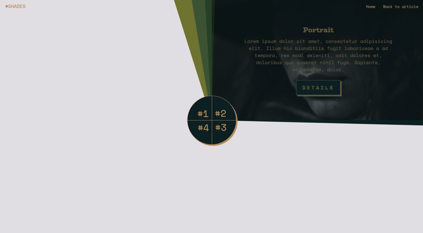
The HTML code specific to our DEMO can be found within the section with the class slideshow. The background image holders have the class background, and the navigation has the class, surprise surprise, navigation.
First, let's clarify the slideshow section, which contains headlines and texts for our slideshow categories, or if you prefer, slideshow items.
1<!-- WANNABEDEV:slideshow START -->
2<section class="slideshow">
3
4  <!-- slideshow:content:item START -->
5  <div class="content main-content" data-id="content-1" style="background-image: url(path/to/first/image.jpeg);">
6    <div class="inner">
7      <h2>Landscape</h2>
8      <div class="description">
9        <p>Lorem ipsum dolor sit amet...</p>
10        <a href="#">Details</a>
11      </div>
12    </div>
13  </div>
14  <!-- slideshow:content:item END -->
15
16  <!-- slideshow:content:item START -->
17  <div class="content main-content-1" data-id="content-2">
18    <div class="inner">
19      <h2>Portrait</h2>
20      <div class="description">
21        <p>Lorem ipsum dolor sit amet...</p>
22        <a href="#">Details</a>
23      </div>
24    </div>
25  </div>
26  <!-- slideshow:content:item END -->
27
28  <!-- ... -->
29</section>
30<!-- WANNABEDEV:slideshow END -->
Looking at the code above, we can see that the HTML part is quite simple, with the data attribute data-id serving as a helper for executing functions. Specifically, the data-id will act as a unique ID for a specific category, which we will search for and activate when clicking on a navigation item (which also has the same ID number). Additionally, you may have noticed that the first content div has a style attribute with a pre-defined active background-image.
This means that the first content will be active on load and display the content of that item, including the background-image. It's worth noting that our DEMO consists of a section with four items, and when downloading and testing the code, please ensure that it remains that way, otherwise, our UI/UX part loses its meaning.
Once again, our section will consist of four items, with the first one being active on load with an assigned background-image, while the other three remain inactive on load and without an assigned background-image.
1<!-- slideshow:rotating-backgrounds END -->
2<div class="background main-background"></div>
3<div class="background main-background-1"></div>
4<div class="background main-background-2"></div>
5<div class="background main-background-3"></div>
6<!-- slideshow:rotating-backgrounds END -->
The second part of the code, which shows multiple div elements with the class background, serves as a holder for the shadows of the background-image that follow the main div and can be seen after clicking on a navigation item and starting the circular animation.
You can find these elements in the CSS file and change their colors. You can also change the number of these elements; if you want more of them, add new div elements with the class background main-background-[NUMBER], and don't forget to add background-color for the newly added elements.
Next, the navigation consists of items that carry specific data attributes: data-id, data-rotation, and data-bcg.
1<!-- slideshow:navigation START -->
2  <ul class="navigation">
3    <li class="nav-item" data-id="1" data-rotation="0" data-bcg="path/to/image.jpeg">
4      <span>#1</span>
5    </li>
6    <li class="nav-item" data-id="2" data-rotation="90" data-bcg="path/to/image.jpeg">
7      <span>#2</span>
8    </li>
9    <li class="nav-item" data-id="3" data-rotation="180" data-bcg="path/to/image.jpeg">
10      <span>#3</span>
11    </li>
12    <li class="nav-item" data-id="4" data-rotation="270" data-bcg="path/to/image.jpeg">
13      <span>#4</span>
14    </li>
15  </ul>
16  <!-- slideshow:navigation END -->
As already mentioned:
data-idwill help us locate which category to activate after clicking on a navigation itemdata-rotationholds the rotation value, indicating the degree of rotation that needs to be applied- and the last data attribute, but by no means unimportant -
data-bcg- where we can find the path to the background image that will be loaded and assigned to the active category after the click.
JavaScript Functionality
The JavaScript part consists of a simple function that we will now try to break down into smaller parts. Let’s start with defining variables.
1// Init variables
2const slideshow = document.querySelector('.slideshow');
3const loader = document.querySelector('.loader');
4const navItems = document.querySelectorAll('.nav-item');
5const background = document.querySelectorAll('.background');
6const content = document.querySelectorAll('.content');
7let activeID = null;
8let activeImage = null;
9let activeContent = null;
10let rotation = null;
11const type = "_short";
The most interesting thing you can see in the code above is that we have selected all the elements using document.querySelector or document.querySelectorAll, which we will later use in our function in one way or another.
We have also declared several variables: activeID, activeImage, activeContent, and rotation. These variables will be updated every time we click on one of the navigation items. Initially, all of them have a value of null.
Another variable that can be found in the code above is the type variable. As you can see, its value is "_short". With some animation engines, it can be frustrating to try to rotate something in a specific direction. However, with GSAP, you have the option to explicitly set the direction or let GSAP determine the shortest distance. This is the case in our example.
1gsap.config({
2   force3D: false
3});
In this part of the function, the force3D option is used to configure the GSAP library. Specifically, the force3D option is set to false.
By default, GSAP automatically enables 3D rendering to improve performance. When elements are transformed or animated, GSAP applies the CSS property transform: translateZ(0) to trigger hardware acceleration and promote the element to a separate layer. This can enhance rendering performance, especially for complex animations or when animating multiple elements simultaneously.
However, there are cases where enabling 3D rendering may have unintended side effects. In some situations, it can cause elements to appear blurry or introduce rendering artifacts. The force3D option allows you to control whether GSAP should automatically enable 3D rendering or not.
It's worth noting that the choice of enabling or disabling 3D rendering depends on the specific requirements and characteristics of your animations and target devices. You can experiment with different settings and observe the performance and visual results to determine the most suitable approach for your project.
1function setTweenValues(item) {
2  rotation = Number(item.dataset.rotation);
3  activeID = item.dataset.id;
4  activeImage = item.dataset.bcg;
5  activeContent = slideshow.querySelector(`[data-id='content-${activeID}']`);
6}
The setTweenValues function is responsible for assigning the tween values based on the selected navigation item. It accepts an item parameter, which represents the clicked navigation item. In other words, the setTweenValues function extracts the required values from the data attributes of the clicked navigation item and assigns them to corresponding variables (rotation, activeID, activeImage, activeContent) for later use in the animation.
1function doTween() {
2  content.forEach(function(elem) {
3    gsap.set(elem, {
4      backgroundImage: ''
5    });
6    gsap.set(elem.querySelector('.inner'), {
7      autoAlpha: 0
8    });
9  });
10
11  const timeline = gsap.timeline();
12
13  timeline
14    .staggerTo(document.querySelectorAll('.inner'), 0, { autoAlpha: 0, ease: 'power4.inOut' }, 0)
15    .to(activeContent, { duration: 0.75, autoAlpha: 0, ease: 'power4.inOut' }, '-=0.75')
16    .to(activeContent, { duration: 0.75, backgroundImage: `url(${activeImage})` }, '-=0.75')
17    .staggerTo(background, 1.5, { rotation: `${rotation}${type}`, transformOrigin: "100% 100%", ease: 'back.out(1.6)' }, 0.075)
18    .to(activeContent, { duration: 0.75, autoAlpha: 1, rotation: 0, ease: 'power4.inOut' }, '-=1.5')
19    .to(activeContent.querySelector('.inner'), { duration: 0.75, autoAlpha: 1, ease: 'power4.inOut' }, '-=2.5');
20
21  timeline.play();
22}
The doTween function is responsible for executing the animation sequence based on the values set by the setTweenValues function.
content.forEach loop iterates over each content element and resets the backgroundImage property to an empty string, effectively removing any background image. It also sets the autoAlpha property of the inner element (with the class .inner) to 0, making it transparent.
Next, we create a GSAP timeline using the gsap.timeline() method and define the animation steps:
The timeline allows for sequential execution of animations. The animation steps are defined using the .to() method, which animates specific properties of the activeContent element, and .staggerTo()method, which animates specific properties of the background element:
- The first
.to()call animates theautoAlphaproperty ofactiveContentto 0, making it fade out over a duration of 0.75 seconds. - The second
.to()call animates thebackgroundImageproperty ofactiveContentto the specifiedactiveImageURL, creating a fade-in effect. - The
.staggerTo()call animates therotationproperty of thebackgroundelements, applying a staggered rotation effect with the specifiedrotationvalue and easing. - The third
.to()call animates theautoAlphaandrotationproperties ofactiveContent, making it fade in and resetting the rotation to 0. - The last
.to()call animates theautoAlphaproperty of the inner element withinactiveContent, making it fade in.
And finally, we use the play() function to start the timeline and initiate the animation sequence.
1navItems.forEach(function(item) {
2  item.addEventListener('click', function() {
3    doTween();
4  });
5
6  item.addEventListener('mouseenter', function() {
7    setTweenValues(item);
8  });
9});
This code snippet sets up event listeners for each navItem element.
Using item.addEventListener('click') we can add a click event listener to the navItem element. When the element is clicked, the doTween() function is called to initiate the animation sequence.
And using item.addEventListener('mouseenter') we can add a mouseenter event listener to the navItem element. When the mouse enters the element, the setTweenValues(item) function is called. This function extracts specific values from the item and assigns them to variables such as rotation, activeID, activeImage, and activeContent.
I hope you were able to follow and understand all the code that we have programmed and presented in this tutorial. If you think it can help others, feel free to share the article with your friends. In the meantime, explore both our categories of tutorials and guides.
Get inspired, code, and be happy.
See you soon. Cheers!
Credits
- GSAP by Greensock
- imagesLoaded by David DeSandro
- Fonts BioRhyme & Space Mono by Google Fonts
- Simple Loader by loading.io
- Color Palette by coolors.co