Unique Transition Between Grid and List Views
A switcher that changes the layout between grid and list view can be a very useful feature on many websites or applications. While the grid view provides better insights and more details about each item, the list view allows for displaying more items in a smaller space and thus potentially facilitates faster identification of a specific item.
By searching the internet, you can easily find many examples of how to create a transition between grid and list views. However, most of the examples you come across only perform the transformation itself without considering the time that occurs exactly during the transition from one layout to another, the time between the grid layout and view layout.
Well, if you're one of those who needs something more than just a boring transformation, you're in the right place. Don't leave the website, don't change the TV channel, fasten your seatbelt - we're taking off. 🚀
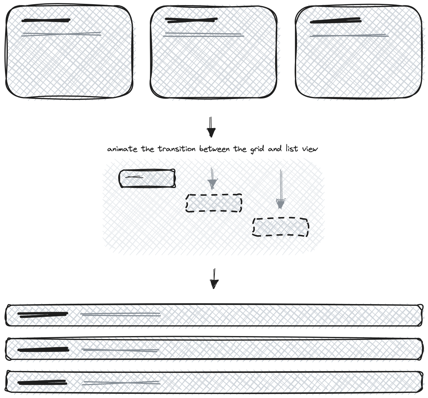
In the sketch above, you can see exactly the time interval I was talking about in the introduction. Besides the solid design we created for each of the layouts, we also created a simple animation using CSS and JavaScript, with the help of two well-known JavaScript libraries: Masonry and Greensock. Let's get started with the code, which we will break down into shorter snippets and try to explain in the best possible way.
Grid-List View Switcher
Let's start by adding the necessary HTML structure to enable the grid-list view switcher. In the HTML file, find the section with the class grid-holder. Inside this section, we will find a div with the class grid-list-layout that contains the navigation and switcher elements.
1<!-- wannabedev:grid-list START -->
2<section class="grid-holder">
3
4  <!-- wannabedev:grid-list:navigation+switcher START -->
5  <div class="grid-list-layout">
6    <!-- NAVIGATION (not important at all for our demo) -->
7
8    <div class="grid-list-holder">
9      <span class="grid-layout active">
10        <!-- Grid layout icon SVG code -->
11      </span>
12      <span class="list-layout">
13        <!-- List layout icon SVG code -->
14      </span>
15    </div>
16  </div>
17  <!-- wannabedev:grid-list:navigation+switcher END -->
18
19  <!-- ... -->
20</section>
21<!-- wannabedev:grid-list END -->
We gave the switcher elements following classes: grid-layout and list-layout. When you click on the one of these elements, it will trigger the animation and add the active class to the clicked element. On page load, you can choose which element will be initially active by default.
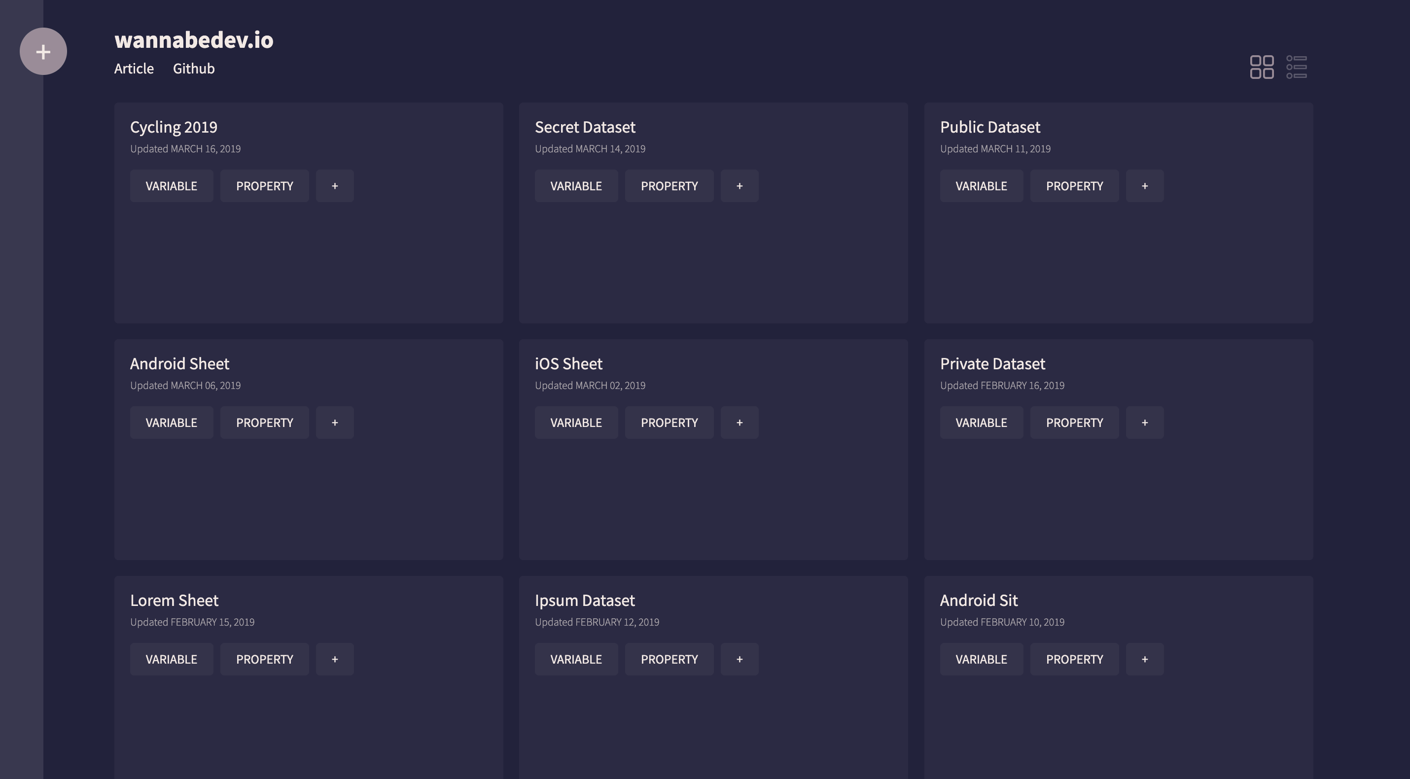
Grid and List items
It's time to add the actual grid with the grid items that will be animated and transformed. In this step, it's important to note that all HTML elements within each grid item will have the same layout.
We need to create the grid structure that will be used by the Masonry library. To do so, just create a div element with classes gird and masonry. When that is done, populate the div with couple of grid items. Make sure that every grid item has a class masonry__item.
1<!-- wannabedev:grid-list:main-section START -->
2<div class="grid masonry">
3  <div class="masonry__item">
4    <figure>
5      <figcaption class="content">
6        <h2>Cycling 2019</h2>
7        <!-- Content description -->
8      </figcaption>
9    </figure>
10  </div>
11
12  <div class="masonry__item">
13    <figure>
14      <figcaption class="content">
15        <h2>Secret Dataset</h2>
16        <!-- Content description -->
17      </figcaption>
18    </figure>
19  </div>
20
21  <!-- Additional masonry__item elements -->
22</div>
23<!-- wannabedev:grid-list:main-section END -->
We chose to use the Masonry library because it allows us to achieve a dynamic layout that adjusts based on the available space. This means that regardless of the screen size or container dimensions, Masonry will intelligently position the grid items to create a visually appealing layout. It helps in achieving a responsive and flexible design, making it a suitable choice for creating grid-based layouts.
Creating Smooth Transitions with GSAP
To animate transition between the grid and list views, we will use GreenSock library.
GreenSock (GSAP) is a powerful JavaScript library known for its exceptional animation capabilities. With GSAP, you can easily create smooth and visually appealing animations. It provides a timeline-based approach, allowing you to control animations, sequencing, and synchronization. GSAP offers a wide range of easing functions and transforms, enabling captivating motion effects and transitions. It's a popular choice among developers for creating stunning web animations.
We begin by defining several CSS selectors to target specific elements in the UI, such as the grid, masonry items, loader, date, tags, and layout switchers elements. These selectors are represented as variables for easy reference throughout the code.
1const gridSelector = '.grid';
2const masonryItemSelector = '.masonry__item';
3const loaderSelector = '.loader';
4const dateSelector = '.date';
5const tagsSelector = '.tags';
6const listLayoutSelector = '.list-layout';
7const gridLayoutSelector = '.grid-layout';
Next, the Masonry library is initialized by creating a new instance of Masonry and passing the gridSelector and masonryItemSelector as an option. This sets up the masonry layout for the grid.
1new Masonry(gridSelector, {
2  itemSelector: masonryItemSelector
3});
After a dummy delay of 750ms (just for the demo purposes), the loader element is selected using the loader selector, and the is-loaded class is added to it. This visually hides the loader from the UI, providing a smooth transition.
1setTimeout(() => {
2  document.querySelector(loaderSelector).classList.add('is-loaded');
3}, 750);
To add visual styling and positioning to the first, second, and third items in each row of the grid, we can use the Masonry item selector and add classes such as top, middle and bottom to these items accordingly. This approach helps us accurately locate each item and determine how each item should be animated.
By assigning these classes on the grid items, we can apply specific styles or animations to each item based on its position within the row. For example, we can use CSS rules or JavaScript animations to create different visual effects or transitions for the top, middle, and bottom items. This allows for more control over the presentation and animation of each item in the grid layout.
1const classes = ['top', 'middle', 'bottom'];
2document.querySelectorAll(masonryItemSelector).forEach((element, index) => {
3  element.classList.add(classes[index % 3]);
4});
The functions that actually perform the layout transformation and add animations are the listLayout and gridLayout functions.
The listLayout function handles the layout transformation from a grid view to a list view. In the listLayout function, we first need to create several GSAP Timelines, including the masterTimeline, which serves as the main timeline. We will play or reverse this timeline depending on which layout we want to activate by clicking on the elements mentioned in the grid-list-layout.
1const listLayout = (element) => {
2  // Initialize variables
3  const masterTimeline = gsap.timeline({ paused: true });
4  const topTimeline = gsap.timeline();
5  const middleTimeline = gsap.timeline();
6  const bottomTimeline = gsap.timeline();
7  const topPosition = parseInt(element.offsetTop);
8  const topPositionSecond = topPosition + 80;
9  const topPositionThird = topPosition + 160;
10
11  // Update position: top for each item in grid
12  if (element.classList.contains('top')) {
13    topTimeline.to(element, 1.05, { top: topPosition, ease: Expo.easeInOut });
14  }
15  if (element.classList.contains('middle')) {
16    middleTimeline.to(element, 1.05, { top: topPositionSecond, ease: Expo.easeInOut });
17  }
18  if (element.classList.contains('bottom')) {
19    bottomTimeline.to(element, 1.05, { top: topPositionThird, ease: Expo.easeInOut });
20  }
21
22  // Populate master timeline
23  masterTimeline
24    .to(element.querySelector(dateSelector), 0.35, { autoAlpha: 0, ease: Expo.easeInOut })
25    .to(element.querySelector(tagsSelector), 0.35, { autoAlpha: 0, ease: Expo.easeInOut }, '-=0.35')
26    .to(element, 0.35, { height: 80, ease: Expo.easeInOut })
27    .add(topTimeline, -0.35)
28    .add(middleTimeline, -0.35)
29    .add(bottomTimeline, -0.35)
30    .to(element, 0.35, { width: '100%', left: 0, ease: Expo.easeInOut })
31    .to(element.querySelector(dateSelector), 0.35, { autoAlpha: 1, ease: Expo.easeInOut })
32    .to(element.querySelector(tagsSelector), 0.35, { y: -24, autoAlpha: 1, ease: Expo.easeInOut }, '-=0.35');
33
34  // Play the animation
35  masterTimeline.play();
36};
This timeline will encompass all the animations on the layout elements, including the additional timelines created at the beginning of the function: topTimeline, middleTimeline, and bottomTimeline. As their names suggest, the topTimeline targets all the layout elements with the class top and animates their top position. The middleTimeline locates all the elements with the class middle and animates their top position as well. Finally, the bottomTimeline will locate and animate all the elements with the bottom class.
The masterTimeline is initially paused at the beginning of the function and will be triggered to play only when the function is called.
The gridLayout function is similar to listLayout, but it handles the layout transformation from list to grid. It applies animations to update the position and appearance of the element based on its class, similar to what was mentioned in the listLayout function. The only difference is that, to avoid overlapping, we first animate the left position and then the top position of the element, and then add them to the masterTimeline.
1const gridLayout = (element) => {
2  // Initialize variables
3  const masterTimeline = gsap.timeline({ paused: true });
4  const topTimeline = gsap.timeline();
5  const middleTimeline = gsap.timeline();
6  const bottomTimeline = gsap.timeline();
7  const topPosition = parseInt(element.offsetTop);
8  const topPositionSecond = topPosition - 80;
9  const topPositionThird = topPosition - 160;
10
11  // Update position: left
12  if (element.classList.contains('top')) {
13    topTimeline.to(element, 1.05, { left: 0, ease: Expo.easeInOut });
14  }
15  if (element.classList.contains('middle')) {
16    middleTimeline.to(element, 1.05, { left: '33.3333%', ease: Expo.easeInOut });
17  }
18  if (element.classList.contains('bottom')) {
19    bottomTimeline.to(element, 1.05, { left: '66.6666%', ease: Expo.easeInOut });
20  }
21  // Update position: top (to prevent overlapping)
22  if (element.classList.contains('top')) {
23    topTimeline.to(element, 0.7, { top: topPosition, ease: Expo.easeInOut });
24  }
25  if (element.classList.contains('middle')) {
26    middleTimeline.to(element, 0.7, { top: topPositionSecond, ease: Expo.easeInOut });
27  }
28  if (element.classList.contains('bottom')) {
29    bottomTimeline.to(element, 0.7, { top: topPositionThird, ease: Expo.easeInOut });
30  }
31
32  // Populate master timeline
33  masterTimeline
34    .to(element.querySelector(dateSelector), 0.35, { autoAlpha: 0, ease: Expo.easeInOut })
35    .to(element.querySelector(tagsSelector), 0.35, { autoAlpha: 0, ease: Expo.easeInOut }, '-=0.35')
36    .to(element, 0.7, { width: '33.3333%', ease: Expo.easeInOut })
37    .add(topTimeline, -0.35)
38    .add(middleTimeline, -0.35)
39    .add(bottomTimeline, -0.35)
40    .to(element, 0.35, { height: 240, ease: Expo.easeInOut }, '-=0.5')
41    .to(element.querySelector(dateSelector), 0.35, { autoAlpha: 1, ease: Expo.easeInOut })
42    .to(element.querySelector(tagsSelector), 0.35, { y: 0, autoAlpha: 1, ease: Expo.easeInOut }, '-=0.35');
43
44  // Play the animation
45  masterTimeline.play();
46};
Now, we need to attach event listeners for the list layout selector and grid layout selector. When clicked, these event listeners will remove/add the active class to the respective layout selectors and call the listLayout or gridLayout functions for each masonry item to transform them accordingly.
1document.querySelector(listLayoutSelector).addEventListener('click', () => {
2  // Remove and add active classes
3  document.querySelector(gridLayoutSelector).classList.remove('active');
4  document.querySelector(listLayoutSelector).classList.add('active');
5  // Call list function for each masonry item
6  const elements = document.querySelectorAll(masonryItemSelector);
7  elements.forEach((element) => {
8    listLayout(element);
9  });
10});
11
12document.querySelector(gridLayoutSelector).addEventListener('click', () => {
13  // Remove and add active classes
14  document.querySelector(listLayoutSelector).classList.remove('active');
15  document.querySelector(gridLayoutSelector).classList.add('active');
16  // Call grid function for each masonry item
17  const elements = document.querySelectorAll(masonryItemSelector);
18  elements.forEach((element) => {
19    gridLayout(element);
20  });
21});
To access the complete JavaScript code, I recommend checking out the demo code on our GitHub page. You can see the bigger picture and how everything is connected together.
Conclusion
If you've made it all the way here, I must say that I'm glad you found the tutorial interesting! The combination of imagination and code can truly create incredible things. It's always challenging and fun to experiment with different technologies and tools to bring our ideas to life. Keep exploring and creating, and who knows what wonders you'll be able to create!
If you have any further questions or require additional assistance, please feel free to reach out to us via email or through our social media channels. We are here to help and will be happy to assist you.
Credits
- The inspiration for effects and Layout comes from kreatıva
- GSAP by Greensock
- imagesLoaded by David DeSandro
- Font Source Sans Pro by Google Fonts
- Simple Loader by loading.io
- Color Palette by coolors.co
- Prev and Next Icons made by Freepik from Flaticon are licensed by CC 3.0