Circular Slider with Anime.js
Rotating parallax sliders are a popular way to display content. They are most commonly positioned in the so-called Hero section and are tasked with presenting content in an interesting manner and capturing the visitors' attention for the product you are selling at first glance.
Such is the case with our slider in this tutorial as well. Keep in mind that my main goal and focus were to demonstrate how you can create a complex slider in a straightforward manner using Anime.js, incorporating both rotation and parallax effects simultaneously. If you don't like the design, you can easily change and customize it to fit your needs. 3,2,1 Go!
In this tutorial, we'll guide you through the process of creating a rotating parallax slider using HTML, CSS, JavaScript and the Anime.js library. With this slider, you'll be able to smoothly transition between slides with cool animations each time you click on navigation buttons or pagination items.
HTML Part
We will break down and describe the HTML structure of a rotating parallax slider that you can use as a foundation for your web projects. This HTML structure is the base of a slider that's both interactive and visually attractive. Let's dive into the details:
The Page Wrapper
1<section class="page-wrapper" id="wannabedev">
2  <!-- ... -->
3</section>
The <section> element with the class "page-wrapper" and the "id" attribute "wannabedev" serves as the outer container for your slider. You can adjust the class and ID as needed to match your project's styling and structure. This container provides a structured and organized space for your slider to reside within your webpage.
The Slider Container
1<div class="slider">
2  <!-- ... -->
3</div>
Inside the page wrapper, we have a <div> element with the class "slider." This container houses the entire rotating slider. All the slides, navigation controls, and animations will be encapsulated within this element.
The Slider List
1<ul class="slider-list">
2  <!-- Slide 1 -->
3  <li class="slider-list__item slider-list__item_active">
4    <!-- Elements for Slide 1 -->
5  </li>
6
7  <!-- Slide 2 -->
8  <li class="slider-list__item">
9    <!-- Elements for Slide 2 -->
10  </li>
11
12  <!-- Slide 3 -->
13  <li class="slider-list__item">
14    <!-- Elements for Slide 3 -->
15  </li>
16</ul>
The <ul> element with the class "slider-list" represents the list of slides within the slider. Each slide is represented by an <li> element with the class "slider-list__item." By adding the "slider-list__item_active" class to the first slide, you indicate which slide should be initially displayed as active when the slider loads. Each slide is a container for various elements, such as images, titles, and additional content.
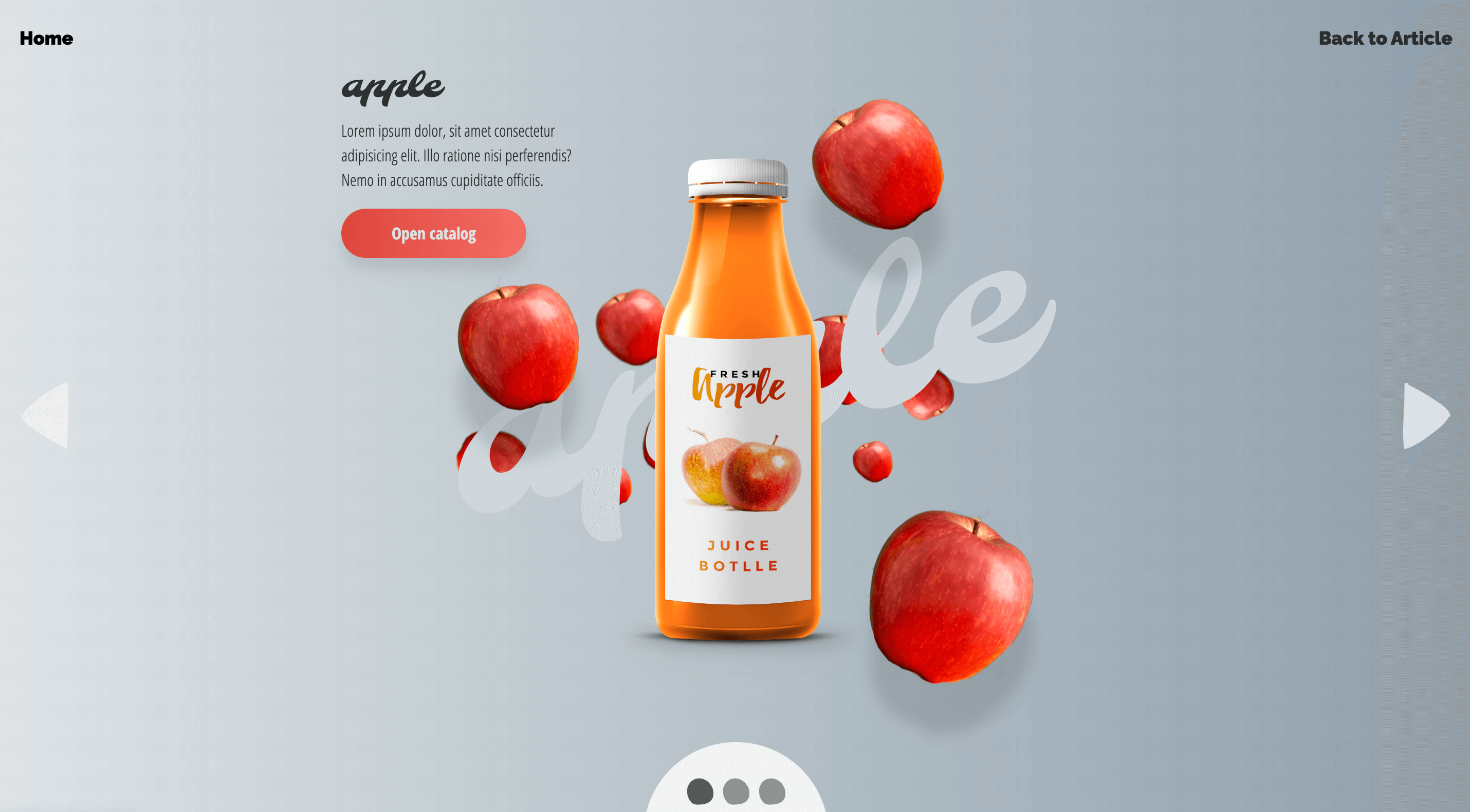
Individual Slide Elements
1<!-- Inside each slide -->
2<span class="back__element">
3  <img src="assets/img/back_apple_002.png" />
4</span>
5<span class="main__element">
6  <img src="assets/img/bottle_apple_002.png" />
7</span>
8<span class="front__element">
9  <img src="assets/img/front_apple_002.png" />
10</span>
11<span class="title__element">
12  <span class="title">apple</span>
13</span>
14<span class="more__element">
15  <span class="content">
16    <!-- Content for Slide -->
17  </span>
18</span>
Each individual slide within the slider contains a set of elements. These elements are organized to create a visually engaging slide. They include:
back__element: The back element for background visuals.main__element: The main element for the primary content, often an image.front__element: The front element for overlay content.title__element: The title element for the slide title.more__element: Additional content and links for the slide.
You can customize the content and images within these elements to match the content you want to display on each slide.
Navigation Bar
1<div class="slider__nav-bar">
2  <a class="nav-control"></a>
3  <a class="nav-control"></a>
4  <a class="nav-control"></a>
5</div>
The navigation bar, represented by the <div> element with the class "slider__nav-bar," provides a visual indicator for the slides. In this example, we have three navigation controls represented by <a> elements with the class "nav-control." These controls allow users to easily navigate between the slides.
Slider Controls
1<div class="slider__controls">
2  <a class="slider__arrow slider__arrow_prev"></a>
3  <a class="slider__arrow slider__arrow_next"></a>
4</div>
The slider controls section, enclosed in a <div> with the class "slider__controls," includes navigation arrows for moving to the previous and next slides. The "slider__arrow" and "slider__arrow_prev" and "slider__arrow_next" classes are used to style and control these navigation buttons.
We will omit the CSS section from the article to keep it as clean and readable as possible. You can, obviously, find it in the source code of the demo page.
You can further customize this structure with CSS for styling and JavaScript for interactivity.
Javascript Part
Anime.js is a lightweight JavaScript animation library with a simple, yet powerful API. It works with CSS properties, SVG, DOM attributes and JavaScript Objects.
Setting up the HTML Structure
To begin, let's show the simplified HTML structure for our rotating parallax slider. We'll need a container element for the slider, individual slide elements, navigation buttons (previous and next), and pagination items. Here's the HTML structure:
1<!-- HTML Structure -->
2<div class="slider">
3  <div class="slider-list__item">Slide 1</div>
4  <div class="slider-list__item">Slide 2</div>
5  <!-- Add more slides as needed -->
6</div>
7<div class="slider__nav-bar">
8  <button class="slider__arrow_prev">Previous</button>
9  <button class="slider__arrow_next">Next</button>
10</div>
11<div class="pagination">
12  <span class="nav-control">1</span>
13  <span class="nav-control">2</span>
14  <!-- Add more pagination items as needed -->
15</div>
Writing the JavaScript Slider Class
With the HTML structure in place, let's create a JavaScript class called Slider to handle all the functionality of our rotating slider. The constructor initializes various properties like the root element, slides, animation settings, and event bindings. We'll use Anime.js to perform the animations. Here's the code snippet:
1class Slider {
2  constructor(props) {
3    this.rootElement = props.element;
4    this.slides = Array.from(
5      this.rootElement.querySelectorAll(".slider-list__item")
6    );
7    this.slidesLength = this.slides.length;
8    this.current = 0;
9    this.isAnimating = false;
10    this.direction = 1;
11    this.baseAnimeSettings = {
12      rotation: 45,
13      duration: 750,
14      easing: 'easeInOutCirc'
15    };
16    this.baseAnimeSettingsBack = {
17      rotation: 45,
18      duration: 1850,
19      elasticity: (el, i, l) => 200 + i * 200
20    };
21    this.baseAnimeSettingsFront = {
22      rotation: 45,
23      duration: 2250,
24      elasticity: (el, i, l) => 200 + i * 200
25    };
26    this.baseAnimeSettingsTitle = {
27      rotation: 45,
28      duration: 1750,
29      elasticity: (el, i, l) => 200 + i * 200
30    };
31    this.navBar = this.rootElement.querySelector(".slider__nav-bar");
32    this.thumbs = Array.from(this.rootElement.querySelectorAll(".nav-control"));
33    this.prevButton = this.rootElement.querySelector(".slider__arrow_prev");
34    this.nextButton = this.rootElement.querySelector(".slider__arrow_next");
35    this.slides[this.current].classList.add("slider-list__item_active");
36    this.thumbs[this.current].classList.add("nav-control_active");
37    this._bindEvents();
38  }
39  // Other methods go here
40}
Implementing Navigation
Our goTo method is responsible for transitioning between slides. When a user clicks on the next or previous button or a pagination item, this method calculates the next slide index and animates the rotation and translation of elements to create a smooth transition parallax effect. Here's the relevant code snippet:
1goTo(index, dir) {
2  if (this.isAnimating) return;
3  let prevSlide = this.slides[this.current];
4  let nextSlide = this.slides[index];
5
6  this.isAnimating = true;
7  this.current = index;
8  nextSlide.classList.add("slider-list__item_active");
9
10  anime({
11    ...this.baseAnimeSettings,
12    targets: nextSlide,
13    rotate: [90 * dir + 'deg', 0],
14    translateX: [90 * dir + '%', 0]
15  });
16
17  anime({
18    ...this.baseAnimeSettingsBack,
19    targets: nextSlide.querySelectorAll('.back__element'),
20    rotate: [90 * dir + 'deg', 0],
21    translateX: [90 * dir + '%', 0]
22  });
23
24  anime({
25    ...this.baseAnimeSettingsFront,
26    targets: nextSlide.querySelectorAll('.front__element'),
27    rotate: [90 * dir + 'deg', 0],
28    translateX: [90 * dir + '%', 0]
29  });
30
31  anime({
32    ...this.baseAnimeSettingsTitle,
33    targets: nextSlide.querySelectorAll('.title__element'),
34    rotate: [90 * dir + 'deg', 0],
35    translateX: [90 * dir + '%', 0]
36  });
37
38  anime({
39    ...this.baseAnimeSettings,
40    targets: prevSlide,
41    rotate: [0, -90 * dir + 'deg'],
42    translateX: [0, -150 * dir + '%'],
43    complete: (anim) => {
44      this.isAnimating = false;
45      prevSlide.classList.remove("slider-list__item_active");
46      this.thumbs.forEach((item, index) => {
47        const action = index === this.current ? "add" : "remove";
48        item.classList[action]("nav-control_active");
49      });
50    }
51  });
52
53  anime({
54    ...this.baseAnimeSettingsBack,
55    targets: prevSlide.querySelectorAll('.back__element'),
56    rotate: [0, -90 * dir + 'deg'],
57    translateX: [0, -150 * dir + '%']
58  });
59
60  anime({
61    ...this.baseAnimeSettingsFront,
62    targets: prevSlide.querySelectorAll('.front__element'),
63    rotate: [0, -90 * dir + 'deg'],
64    translateX: [0, -150 * dir + '%']
65  });
66
67  anime({
68    ...this.baseAnimeSettingsTitle,
69    targets: prevSlide.querySelectorAll('.title__element'),
70    rotate: [0, -90 * dir + 'deg'],
71    translateX: [0, -150 * dir + '%']
72  });
73}
74
75goStep(dir) {
76  let index = this.current + dir;
77  let len = this.slidesLength;
78  let currentIndex = (index + len) % len;
79  this.goTo(currentIndex, dir);
80}
81
82goNext() {
83  this.goStep(1);
84}
85
86goPrev() {
87  this.goStep(-1);
88}
Creating Pagination
To add pagination, we provide a visual indicator of the current slide. When a new slide becomes active, we update the corresponding pagination item's appearance to reflect the current position in the slider. Here's the relevant code snippet:
1// Inside goTo method
2this.thumbs.forEach((item, index) => {
3  var action = index === this.current ? "add" : "remove";
4  item.classList[action]("nav-control_active");
5});
Handling User Interaction
We bind event listeners to the next and previous buttons as well as the pagination items. When users click these elements, the appropriate slider action is triggered, calling the goTo method with the desired direction. Here's the code snippet:
1_bindEvents()
2
3 {
4  ["goNext", "goPrev", "_navClickHandler"].forEach((method) => {
5    this[method] = this[method].bind(this);
6  });
7  this.nextButton.addEventListener("click", this.goNext);
8  this.prevButton.addEventListener("click", this.goPrev);
9  this.navBar.addEventListener("click", this._navClickHandler);
10}
Initializing the Slider
Finally, we initialize the slider by creating an instance of the Slider class, passing in the root element of our slider container. Here's how you can do it:
1// Initialization
2let slider = new Slider({
3  element: document.querySelector(".slider")
4});
Conclusion
We've demonstrated how to create a rotating parallax slider using JavaScript and Anime.js. With this slider, users can navigate through slides smoothly while enjoying dynamic animations that make the slider visually appealing. You can further customize the slider by adjusting the animation settings, adding additional elements to the slides, or incorporating other features to suit your project's requirements. This rotating parallax slider is not only functional but also a great way to showcase content in an engaging and interactive manner.
Credits
- anime.js by Julian Garnier
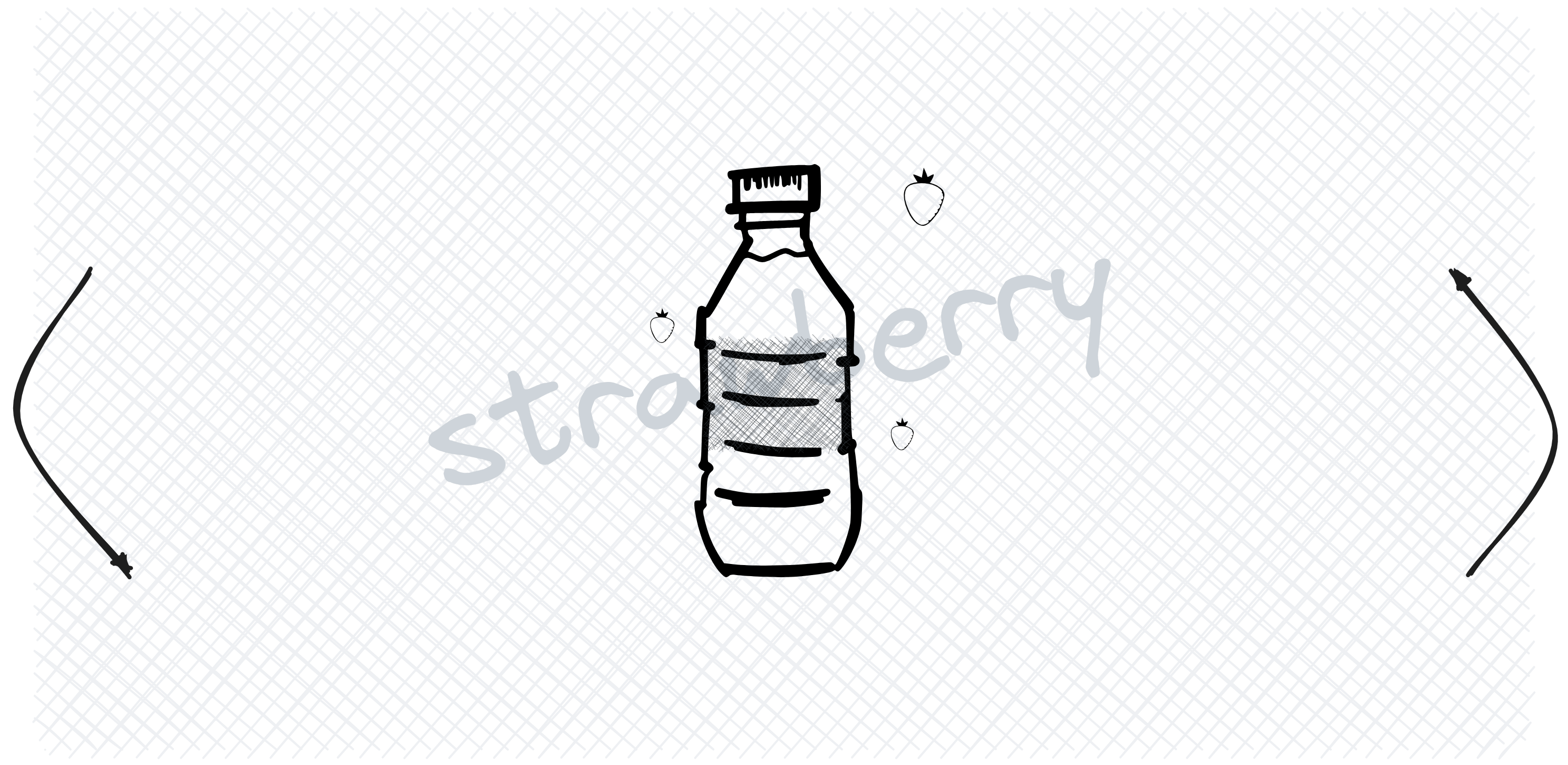
- bottles by GraphicsFuel
- apple designed by Pressfoto from Freepik
- strawberry designed by Topntp26 from Freepik
- grapes designed by Mrsiraphol from Freepik
- strawberry on the featured image designed by prettycons from Flaticon